 Firefox
 1 / 10
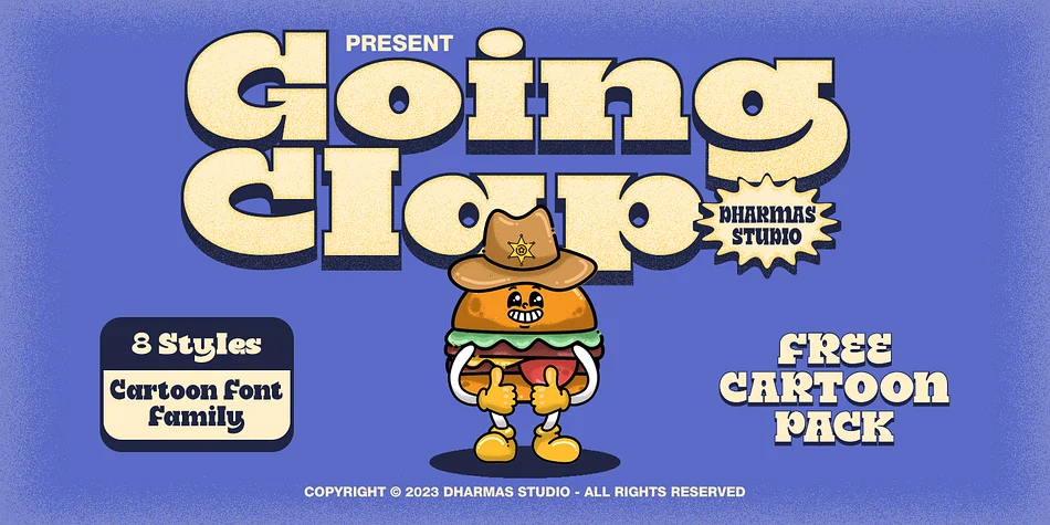
About Going Clap Font
Introducing Going Clap, the font that’s all about bold and nostalgic vibes!
This chunky slab serif typeface is your secret weapon for making text pop with artistic and vintage flair. With 8 unique font families, including Condensed, Normal, Semi Expanded, Expanded, and their cool shadow versions, you’ll find the perfect style for any project.
But that’s not all! When you choose Going Clap, you’ll also get a fantastic bonus—56 retro mascot illustrations for that extra touch of character and nostalgia.
What’s included?
- Going Clap TTF, OTF, WOFF, and WOFF2
- 56 free bonus assets that is Retro Mascot Illustrations
- Has 8 fonts: Condensed, Normal, Semi Expanded, Expanded, Condensed Shadow, Normal Shadow, Semi Expanded Shadow, Expanded Shadow
- Instructions (Access special characters, even in Cricut Design)
- Unique Letterforms
- Works on PC & Mac
- Simple Installations
- Accessible in Adobe Illustrator, Adobe Photoshop, Microsoft Word even Canva!
- PUA Encoded Characters. Fully accessible without additional design software.
Multilingual Supports: (Afrikaans, Albanian, Catalan, Croatian, Czech, Danish, Dutch, English, Estonian, Finnish, French, German, Hungarian, Icelandic, Italian, Lithuanian, Maltese, Norwegian, Polish, Portuguese, Slovenian, Spanish, Swedish, Turkish, Zulu)
Come and say hello over on Instagram! https://www.instagram.com/dharmas.studio/
Thank you,
Dharmas Studio
Style & Use Cases
- Overall Style
- Bold, Distinctive
- Use Case
- Headlines, Posters
- Ideal For
- logos, packaging, and standout titles
- Pairs With
- a neutral sans-serif
How to Install Going Clap Font
Step-by-step instructions for every platform
- 1Download the Going Clap font file (.ttf or .otf).
- 2Locate the downloaded file in your Downloads folder.
- 3Right-click the font file.
- 4Select "Install" to install for the current user, or "Install for all users" to make it available system-wide.
- 5Going Clap is now available in Word, Photoshop, Illustrator, and all other apps.
More by Dharmas Studio
View all →
Browse fonts by theme
Curated collections →Saw a font in a picture? Identify any font from an image with our free Font Finder.
More Decorative Fonts
Browse all →
What pairs well with Going Clap Font?
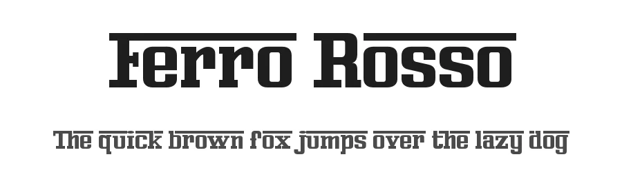
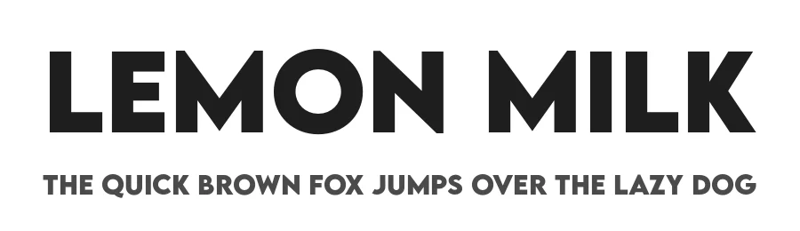
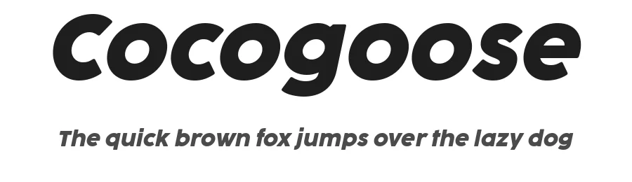
Going Clap Font is a decorative font that shines as a display or heading face. Pair it with a clean sans-serif or serif font for body text — the contrast creates a clear hierarchy while the two styles stay balanced and easy to read.

Going Clap Font
Reviewed by the FontBoxDL team · Updated May 2026