
 1 / 5
1 / 5About Austin Signs Font
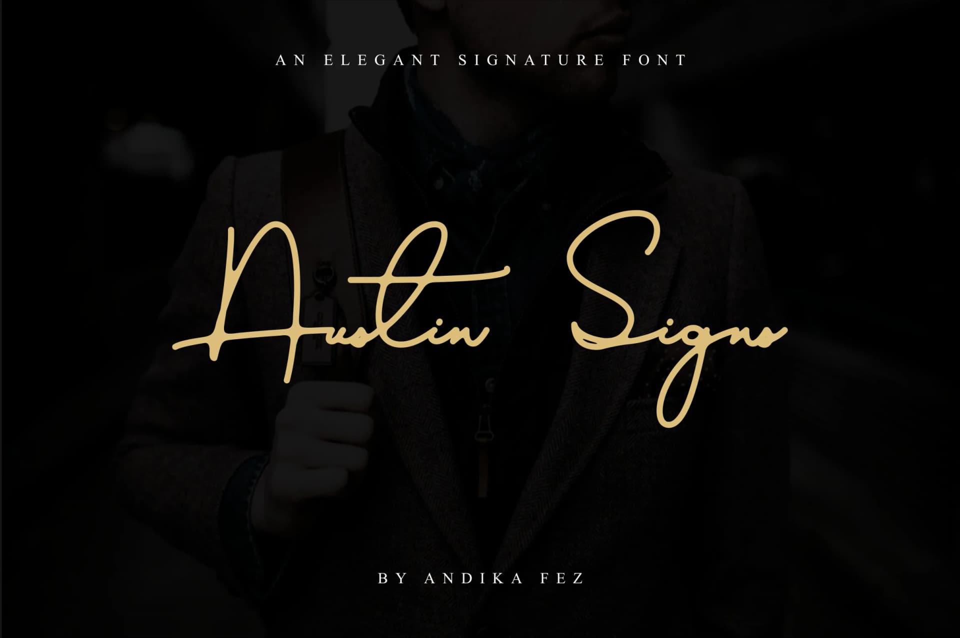
Austin Signs Font by andikafez is a flowing signature script that brings authentic character to contemporary branding work. The naturally connected letterforms translate well across both digital and print applications, making it a versatile choice for designers and creatives seeking personality-driven typography.
This handwritten script performs particularly well in several real-world scenarios. Wedding stationery designers appreciate how Austin Signs conveys intimacy and craftsmanship across invitation suites and custom place cards. Small business owners use the font for artisan product labeling and boutique packaging design, where the genuine handwritten quality builds trust with consumers. Social media creators and entrepreneurs leverage Austin Signs for branded templates, digital product mockups, and coaching business identity systems, where distinctive typography commands immediate attention. The script also suits editorial design applications, from book jacket lettering to magazine mastheads, where its flowing style adds visual sophistication.
The typeface maintains strong readability despite its expressive character, making it practical for real projects rather than purely decorative applications. Its balanced construction works equally well as a primary brand font or as an accent element layered with sans-serif supporting text. Explore Austin Signs Font on Creative Fabrica to incorporate this signature script into your next design project.
Style & Use Cases
- Overall Style
- Elegant, Flowing, Austin Signs
- Use Case
- Invitations, Branding
- Ideal For
- wedding stationery, greeting cards, and signatures
- Pairs With
- a simple uppercase sans
How to Install Austin Signs Font Font
Step-by-step instructions for every platform
- 1Download the Austin Signs Font font file (.ttf or .otf).
- 2Locate the downloaded file in your Downloads folder.
- 3Right-click the font file.
- 4Select "Install" to install for the current user, or "Install for all users" to make it available system-wide.
- 5Austin Signs Font is now available in Word, Photoshop, Illustrator, and all other apps.



More Script Handwritten Fonts
Browse all →







What pairs well with Austin Signs Font?
Austin Signs Font is a script font that shines as a display or heading face. Pair it with a clean sans-serif or serif font for body text — the contrast creates a clear hierarchy while the two styles stay balanced and easy to read.



Austin Signs Font
by andikafez
Reviewed by the FontBoxDL team · Updated May 2026