 Firefox
 1 / 7
1 / 7About Urbano Font
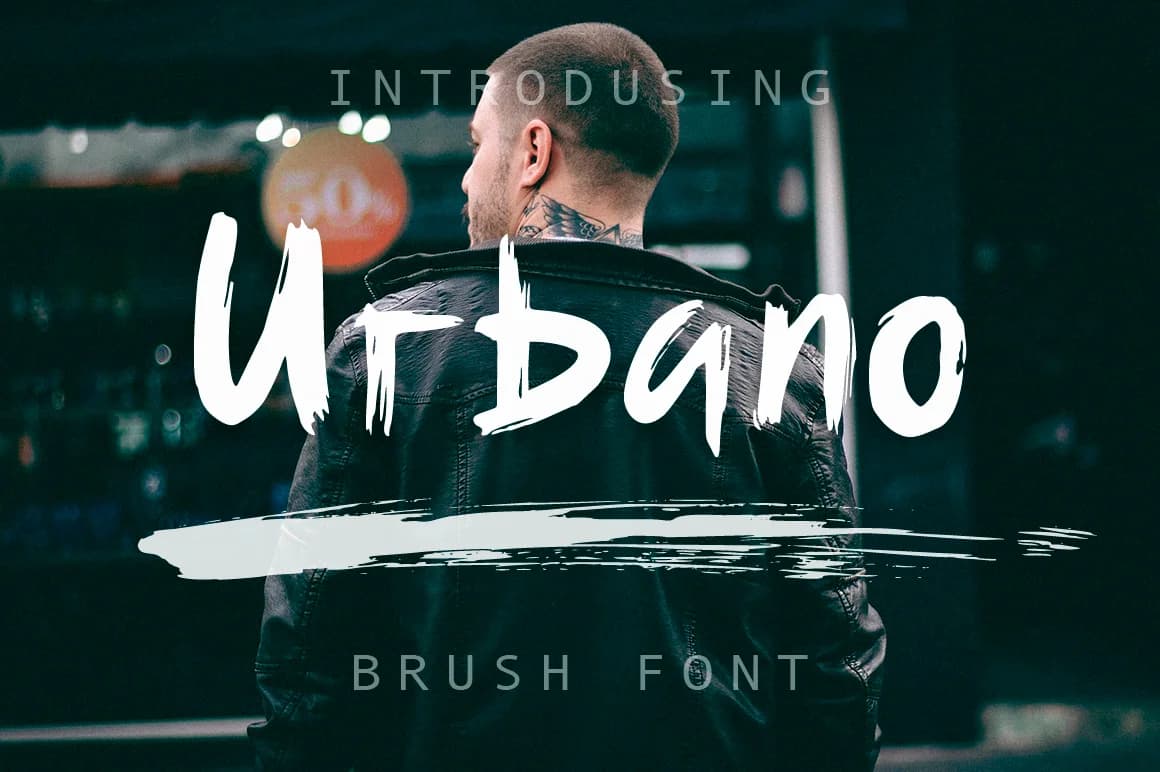
Urbano by Red Ink is an urban handwritten script that channels the raw energy of spontaneous brush lettering into a distinctive, character-rich typeface. Built on dynamic strokes with pronounced texture, this font captures the expressive quality of hand-painted calligraphy while maintaining the versatility and stability needed for professional design applications across various mediums and formats. The rough, gestural qualities of Urbano make it exceptionally well-suited for hand-lettered greeting card suites, contemporary event poster design, and modern social media branding graphics. Its rapid, steep brush work and authentic texture bring distinctive character to custom product labels, boutique packaging design, and DIY craft signage, projects where genuine handmade aesthetics and personality truly matter. The inherent texture variations and weight shifts in the letterforms provide compelling visual interest without requiring additional design elements or effects, making Urbano an efficient and impactful choice for designers working across multiple mediums who prioritize expressive, engaging typography with genuine character. Whether crafting editorial layouts, brand identities, or custom lettering projects, this font brings the personality that comes from confident, natural brush work. Discover Urbano on Creative Fabrica and add brush-lettered character to your next design project.
Style & Use Cases
- Overall Style
- Elegant, Flowing, Urbano
- Use Case
- Invitations, Branding
- Ideal For
- wedding stationery, greeting cards, and signatures
- Pairs With
- a simple uppercase sans
How to Install Urbano Font Font
Step-by-step instructions for every platform
- 1Download the Urbano Font font file (.ttf or .otf).
- 2Locate the downloaded file in your Downloads folder.
- 3Right-click the font file.
- 4Select "Install" to install for the current user, or "Install for all users" to make it available system-wide.
- 5Urbano Font is now available in Word, Photoshop, Illustrator, and all other apps.
Browse fonts by theme
Curated collections →Saw a font in a picture? Identify any font from an image with our free Font Finder.
More Script Handwritten Fonts
Browse all →







What pairs well with Urbano Font?
Urbano Font is a script font that shines as a display or heading face. Pair it with a clean sans-serif or serif font for body text — the contrast creates a clear hierarchy while the two styles stay balanced and easy to read.



Urbano Font
by Red Ink
Reviewed by the FontBoxDL team · Updated May 2026