 Firefox
 1 / 6
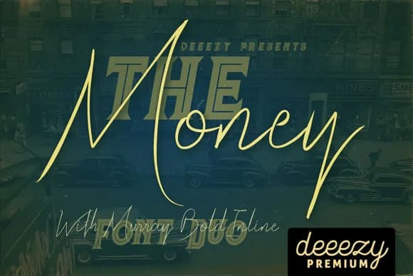
1 / 6About The Money Font
The Money by JumboDesign is a refined monoline script that brings understated elegance to both modern and vintage-inspired visual compositions. This thin-lined handwritten typeface captures the authentic flow of pen lettering while maintaining clean, legible proportions across all applications and sizes. The supplementary inline variant opens additional creative directions, allowing designers to layer effects and create sophisticated typographic treatments that feel hand-crafted yet intentionally refined.
Wedding invitation suites benefit immediately from The Money's personal warmth and sophisticated restraint, while its delicate monoline construction maintains clarity in boutique product labeling and small-scale applications. The typeface works equally well in stationery design and lifestyle branding projects where authentic character builds lasting trust with audiences. This versatility extends to greeting card designs, event programs, and personal brand identity systems, each gaining depth and refinement from the font's quiet sophistication.
The Money excels when you need script letterforms that enhance rather than compete for attention in your layouts. Find this graceful handwritten typeface on Creative Fabrica and begin exploring how refined monoline scripts can add intentional character and warmth to your next creative project.
Style & Use Cases
- Overall Style
- Elegant, Flowing, The Money
- Use Case
- Invitations, Branding
- Ideal For
- wedding stationery, greeting cards, and signatures
- Pairs With
- a simple uppercase sans
How to Install The Money Font Font
Step-by-step instructions for every platform
- 1Download the The Money Font font file (.ttf or .otf).
- 2Locate the downloaded file in your Downloads folder.
- 3Right-click the font file.
- 4Select "Install" to install for the current user, or "Install for all users" to make it available system-wide.
- 5The Money Font is now available in Word, Photoshop, Illustrator, and all other apps.
More by JumboDesign
View all →

Browse fonts by theme
Curated collections →Saw a font in a picture? Identify any font from an image with our free Font Finder.
More Script Handwritten Fonts
Browse all →







What pairs well with The Money Font?
The Money Font is a script font that shines as a display or heading face. Pair it with a clean sans-serif or serif font for body text — the contrast creates a clear hierarchy while the two styles stay balanced and easy to read.



The Money Font
by JumboDesign
Reviewed by the FontBoxDL team · Updated May 2026