 Firefox
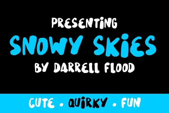
About Snowy Skies Font
Snowy Skies by Dadiomouse is a hand-drawn script font with a playful, contemporary feel that brings genuine personality to casual creative work. The typeface's generous letterforms and light-hearted character make it ideal for projects that benefit from an approachable, youthful aesthetic rather than formal polish. Whether you're designing greeting card interiors, crafting handmade product labels for small online shops, creating playful event signage, or developing a quirky brand identity for a boutique business, Snowy Skies delivers warmth and charm without sacrificing readability. The font includes both regular and italic variants, giving designers flexibility to add visual interest and emphasis throughout their projects. Its casual rhythm and rounded forms feel genuine and handcrafted, making it particularly well-suited to lifestyle branding, DIY craft projects, and contemporary stationery design. The typeface works equally well at large display sizes for headlines and focal points, or as accent text to complement more traditional typefaces in mixed typography layouts. Snowy Skies resonates strongly with designers seeking authenticity in their typography, the kind that feels personal and hand-lettered rather than clinical and mass-produced. If you want to infuse your designs with character and charm, add this distinctive font to your collection on Creative Fabrica.
Style & Use Cases
- Overall Style
- Elegant, Flowing, Snowy Skies
- Use Case
- Invitations, Branding
- Ideal For
- wedding stationery, greeting cards, and signatures
- Pairs With
- a simple uppercase sans
How to Install Snowy Skies Font Font
Step-by-step instructions for every platform
- 1Download the Snowy Skies Font font file (.ttf or .otf).
- 2Locate the downloaded file in your Downloads folder.
- 3Right-click the font file.
- 4Select "Install" to install for the current user, or "Install for all users" to make it available system-wide.
- 5Snowy Skies Font is now available in Word, Photoshop, Illustrator, and all other apps.
More by Dadiomouse
View all →
Browse fonts by theme
Curated collections →Saw a font in a picture? Identify any font from an image with our free Font Finder.
More Script Handwritten Fonts
Browse all →







What pairs well with Snowy Skies Font?
Snowy Skies Font is a script font that shines as a display or heading face. Pair it with a clean sans-serif or serif font for body text — the contrast creates a clear hierarchy while the two styles stay balanced and easy to read.



Snowy Skies Font
by Dadiomouse
Reviewed by the FontBoxDL team · Updated May 2026