 Firefox
 1 / 6
1 / 6About Simple Chalk Font
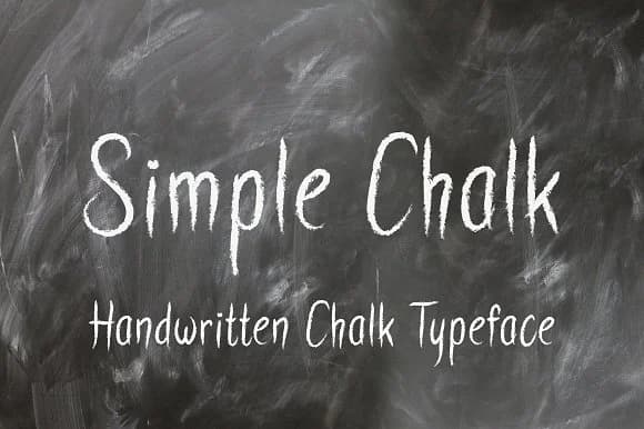
Simple Chalk Font by Royaltype is an informal, playful script that captures the authentic charm of hand-lettered chalkboard writing. With its thin, easy-to-read strokes and natural imperfections, this typeface brings a casual, approachable feel to any creative project that needs genuine warmth and personality. The font's casual nature shines when applied to chalkboard café menus, classroom bulletin board designs, and children's book illustrations that benefit from a friendly, unpretentious aesthetic.
Simple Chalk Font works exceptionally well for educational materials targeting young learners, as its letterforms remain clear and readable without sacrificing character and charm. Whether you're designing greeting cards with a handmade quality, creating whiteboard motivational posters for offices, or developing playful branding for a children's product line, this typeface delivers consistent legibility while maintaining its organic, hand-drawn aesthetic. Its informal structure and thin weight provide an authentic alternative to overly polished scripts that can feel impersonal or corporate.
This font is ready to add genuine character to projects where authenticity and human touch matter more than polish and perfection. Get Simple Chalk Font on Creative Fabrica and start bringing natural, human-centered lettering to your creative work.
Style & Use Cases
- Overall Style
- Elegant, Flowing, Simple Chalk Font
- Use Case
- Invitations, Branding
- Ideal For
- wedding stationery, greeting cards, and signatures
- Pairs With
- a simple uppercase sans
How to Install Simple Chalk Font Font
Step-by-step instructions for every platform
- 1Download the Simple Chalk Font font file (.ttf or .otf).
- 2Locate the downloaded file in your Downloads folder.
- 3Right-click the font file.
- 4Select "Install" to install for the current user, or "Install for all users" to make it available system-wide.
- 5Simple Chalk Font is now available in Word, Photoshop, Illustrator, and all other apps.

Browse fonts by theme
Curated collections →Saw a font in a picture? Identify any font from an image with our free Font Finder.
More Script Handwritten Fonts
Browse all →







What pairs well with Simple Chalk Font?
Simple Chalk Font is a script font that shines as a display or heading face. Pair it with a clean sans-serif or serif font for body text — the contrast creates a clear hierarchy while the two styles stay balanced and easy to read.



Simple Chalk Font
by Royaltype
Reviewed by the FontBoxDL team · Updated May 2026