 Firefox
 1 / 9
1 / 9About Robusta Duo Font
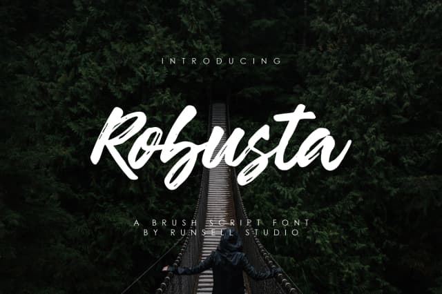
Robusta Duo Font by Runsell Graphic is a brush script with quick, expressive strokes that read as genuinely hand-drawn rather than digitized. The family includes bold and extra-bold weights, giving you real flexibility when you're trying to control hierarchy or shift visual energy across a layout without sacrificing readability or overall impact.
This script excels on projects where character and movement matter most. You'll find it working beautifully for custom wedding invitation suites with that authentic handwritten feel, branding systems for independent fashion labels and boutique product lines, editorial mastheads for design-focused magazines, or packaging for artisan food and beverage companies where visual personality sits at the very core of brand identity. The dry-brush texture prevents the overall effect from feeling over-polished, which means the font holds up beautifully at smaller sizes without requiring a stark or minimal design approach to function and read with clarity.
Reach for Robusta Duo whenever signature style carries more weight than formal restraint. The strokes offer genuine presence without heaviness, working equally well as display typography or bold header text within mixed layouts and compositions. Pick it up on Creative Fabrica and start exploring how those loose, confident strokes can anchor your next design project.
Style & Use Cases
- Overall Style
- Elegant, Flowing, Robusta
- Use Case
- Invitations, Branding
- Ideal For
- wedding stationery, greeting cards, and signatures
- Pairs With
- a simple uppercase sans
How to Install Robusta Duo Font Font
Step-by-step instructions for every platform
- 1Download the Robusta Duo Font font file (.ttf or .otf).
- 2Locate the downloaded file in your Downloads folder.
- 3Right-click the font file.
- 4Select "Install" to install for the current user, or "Install for all users" to make it available system-wide.
- 5Robusta Duo Font is now available in Word, Photoshop, Illustrator, and all other apps.
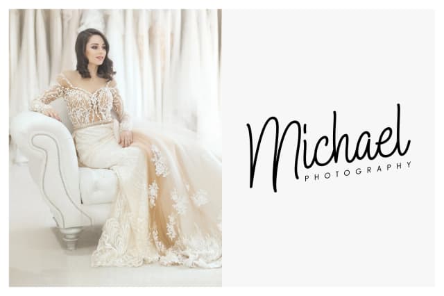
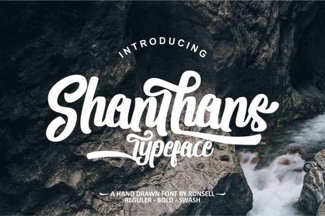
More by Runsell Graphic
View all →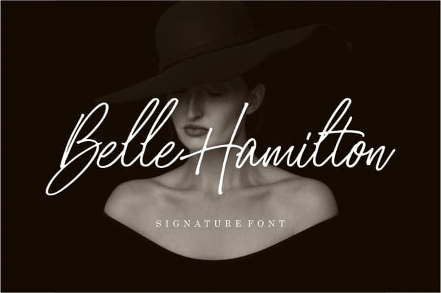
Browse fonts by theme
Curated collections →Saw a font in a picture? Identify any font from an image with our free Font Finder.
More Script Handwritten Fonts
Browse all →







What pairs well with Robusta Duo Font?
Robusta Duo Font is a script font that shines as a display or heading face. Pair it with a clean sans-serif or serif font for body text — the contrast creates a clear hierarchy while the two styles stay balanced and easy to read.



Robusta Duo Font
Reviewed by the FontBoxDL team · Updated May 2026