 Firefox
 1 / 9
1 / 9About Patricia Font
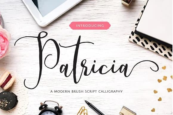
Patricia by No Gravity Type is an elegant calligraphic typeface that captures the delicate energy of flowing handwriting. The script features flowing letterforms with organic swashes that bring sophisticated movement to any project. With its distinctive contrast between thick and thin strokes, Patricia works beautifully across diverse applications.
This typeface shines for wedding stationery and formal invitation suites, where its refined elegance creates an impression of thoughtfulness and care. It's equally suited for greeting card designs seeking understated grace, brand identity work for upscale boutiques and creative agencies, and social media graphics that need visual distinction. The typeface also translates well to packaging projects, from artisanal food labels to luxury skincare branding, where its handcrafted aesthetic conveys sophistication.
Patricia's technical versatility makes it practical for both digital and print applications, working equally well at display sizes for headlines as it does in smaller applications. The attention to detail in its letterforms and swash variations ensures that each use feels intentional and refined, whether you're designing formal stationery or creative promotional materials. Bring Patricia's elegant calligraphic character to your creative projects by adding it to your font library on Creative Fabrica.
Style & Use Cases
- Overall Style
- Elegant, Flowing, Patricia
- Use Case
- Invitations, Branding
- Ideal For
- wedding stationery, greeting cards, and signatures
- Pairs With
- a simple uppercase sans
How to Install Patricia Font Font
Step-by-step instructions for every platform
- 1Download the Patricia Font font file (.ttf or .otf).
- 2Locate the downloaded file in your Downloads folder.
- 3Right-click the font file.
- 4Select "Install" to install for the current user, or "Install for all users" to make it available system-wide.
- 5Patricia Font is now available in Word, Photoshop, Illustrator, and all other apps.
More by No Gravity Type
View all →
Browse fonts by theme
Curated collections →Saw a font in a picture? Identify any font from an image with our free Font Finder.
More Script Handwritten Fonts
Browse all →







What pairs well with Patricia Font?
Patricia Font is a script font that shines as a display or heading face. Pair it with a clean sans-serif or serif font for body text — the contrast creates a clear hierarchy while the two styles stay balanced and easy to read.



Patricia Font
Reviewed by the FontBoxDL team · Updated May 2026