 Firefox
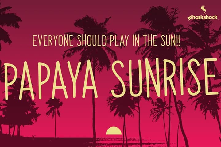
About Papaya Sunrise Font
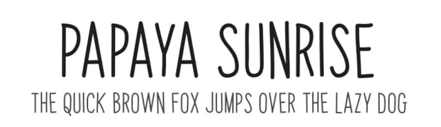
Papaya Sunrise by Sharkshock is a playful handwritten display font that brings casual charm to layouts where informality and genuine personality matter most. With its loose, unpolished letterforms inspired by childlike handwriting, this all-caps typeface delivers strong legibility despite its deliberately imperfect aesthetic. The font captures that authentic, handmade quality that resonates in contexts where commercial polish would feel out of place. Its approachable character works beautifully across greeting card designs, event signage for children's celebrations, social media graphics for casual brands, toy packaging, and DIY birthday invitations that need warmth and authenticity over sophistication. The typeface extends beyond basic Latin letters, supporting extended Latin with full diacritical marks and Cyrillic scripts, all properly kerned for refined output. This multilingual range makes it suitable for international projects while maintaining its distinctive casual voice. Whether you're creating invitations that feel genuinely handmade or crafting signage for spaces where youthful energy and personality take priority, Papaya Sunrise delivers the impact that comes from authentic, unpolished character without requiring refinement or formal presentation. Bring playful warmth to your next project, find Papaya Sunrise on Creative Fabrica.
Style & Use Cases
- Overall Style
- Elegant, Flowing, Papaya Sunrise
- Use Case
- Invitations, Branding
- Ideal For
- wedding stationery, greeting cards, and signatures
- Pairs With
- a simple uppercase sans
How to Install Papaya Sunrise Font Font
Step-by-step instructions for every platform
- 1Download the Papaya Sunrise Font font file (.ttf or .otf).
- 2Locate the downloaded file in your Downloads folder.
- 3Right-click the font file.
- 4Select "Install" to install for the current user, or "Install for all users" to make it available system-wide.
- 5Papaya Sunrise Font is now available in Word, Photoshop, Illustrator, and all other apps.
More by Sharkshock
View all →

Browse fonts by theme
Curated collections →Saw a font in a picture? Identify any font from an image with our free Font Finder.
More Script Handwritten Fonts
Browse all →







What pairs well with Papaya Sunrise Font?
Papaya Sunrise Font is a script font that shines as a display or heading face. Pair it with a clean sans-serif or serif font for body text — the contrast creates a clear hierarchy while the two styles stay balanced and easy to read.



Papaya Sunrise Font
by Sharkshock
Reviewed by the FontBoxDL team · Updated May 2026