 Firefox
 1 / 8
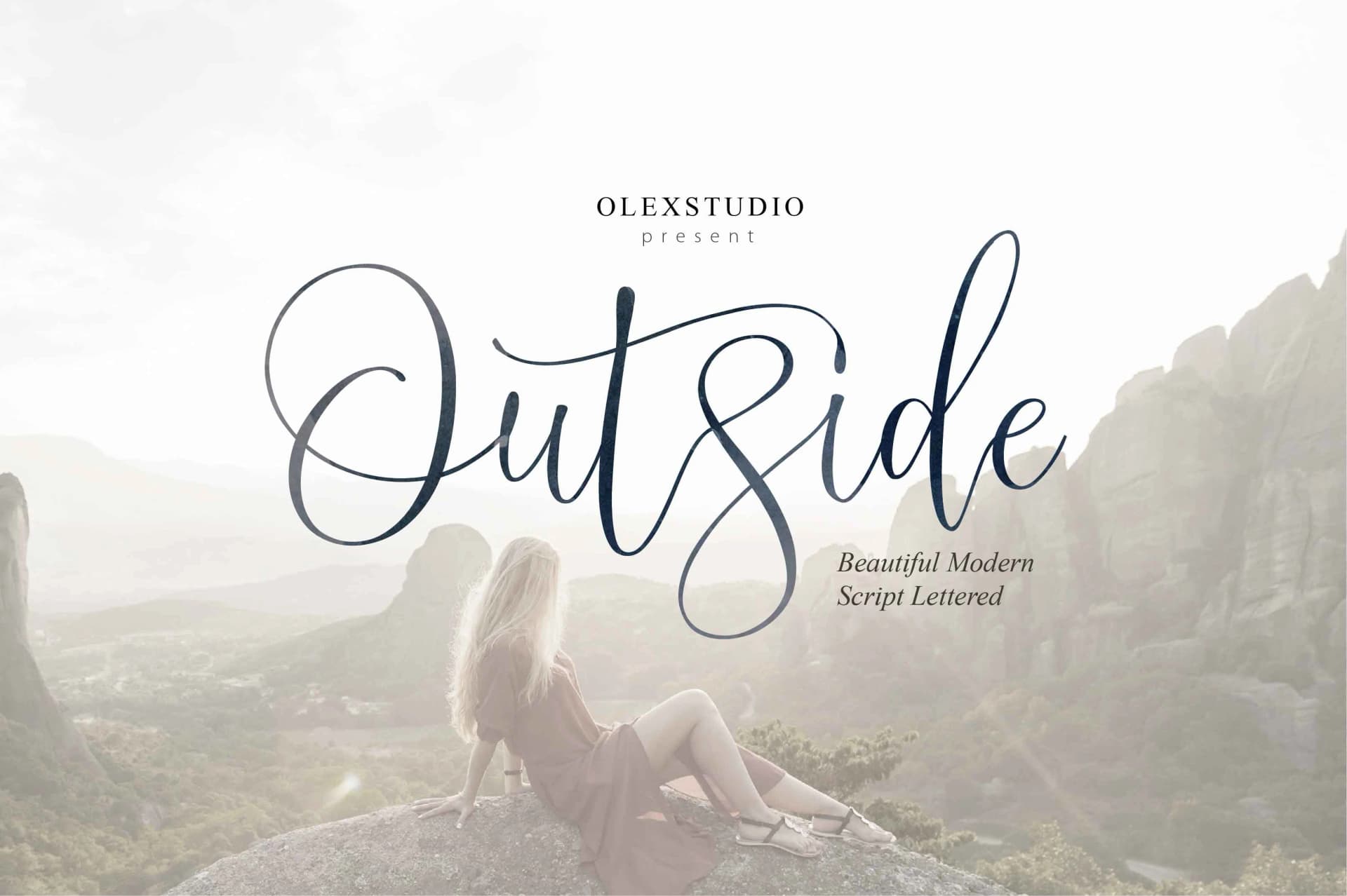
1 / 8About Outside Font
Outside by Olexstudio is a flowing calligraphic script designed to bring refined, handcrafted movement to custom lettering and sophisticated typography projects. The font's extensive collection of swashes and alternate characters makes it an excellent choice for wedding invitation suites, personalized stationery designs, luxury packaging labels, and elegant branding materials where distinctive typography sets a business apart from the competition. Whether you're crafting handmade greeting cards, designing formal event programs, creating bespoke packaging for boutique services, or building high-end branding for lifestyle and luxury brands, Outside offers the decorative power and typographic versatility to handle refined creative applications with flair.
The font performs particularly well for projects calling for a personal, artisanal aesthetic. Use it for restaurant menu designs, custom certificate layouts, book covers, luxury product packaging, and social media graphics for premium lifestyle brands. The flowing, organic letterforms adapt seamlessly across both formal occasions and creative ventures that demand a distinctive, memorable typographic voice. Each composition carries the visual weight of sophistication and careful attention to detail, making it an ideal choice for designers seeking a refined alternative to more commonly used display typefaces.
Discover how Outside's refined elegance can enhance your next design project by accessing it on Creative Fabrica.
Style & Use Cases
- Overall Style
- Elegant, Flowing, Outside
- Use Case
- Invitations, Branding
- Ideal For
- wedding stationery, greeting cards, and signatures
- Pairs With
- a simple uppercase sans
How to Install Outside Font Font
Step-by-step instructions for every platform
- 1Download the Outside Font font file (.ttf or .otf).
- 2Locate the downloaded file in your Downloads folder.
- 3Right-click the font file.
- 4Select "Install" to install for the current user, or "Install for all users" to make it available system-wide.
- 5Outside Font is now available in Word, Photoshop, Illustrator, and all other apps.


Browse fonts by theme
Curated collections →Saw a font in a picture? Identify any font from an image with our free Font Finder.
More Script Handwritten Fonts
Browse all →







What pairs well with Outside Font?
Outside Font is a script font that shines as a display or heading face. Pair it with a clean sans-serif or serif font for body text — the contrast creates a clear hierarchy while the two styles stay balanced and easy to read.



Outside Font
by Olexstudio
Reviewed by the FontBoxDL team · Updated May 2026