 Firefox
 1 / 6
1 / 6About Mystery Font
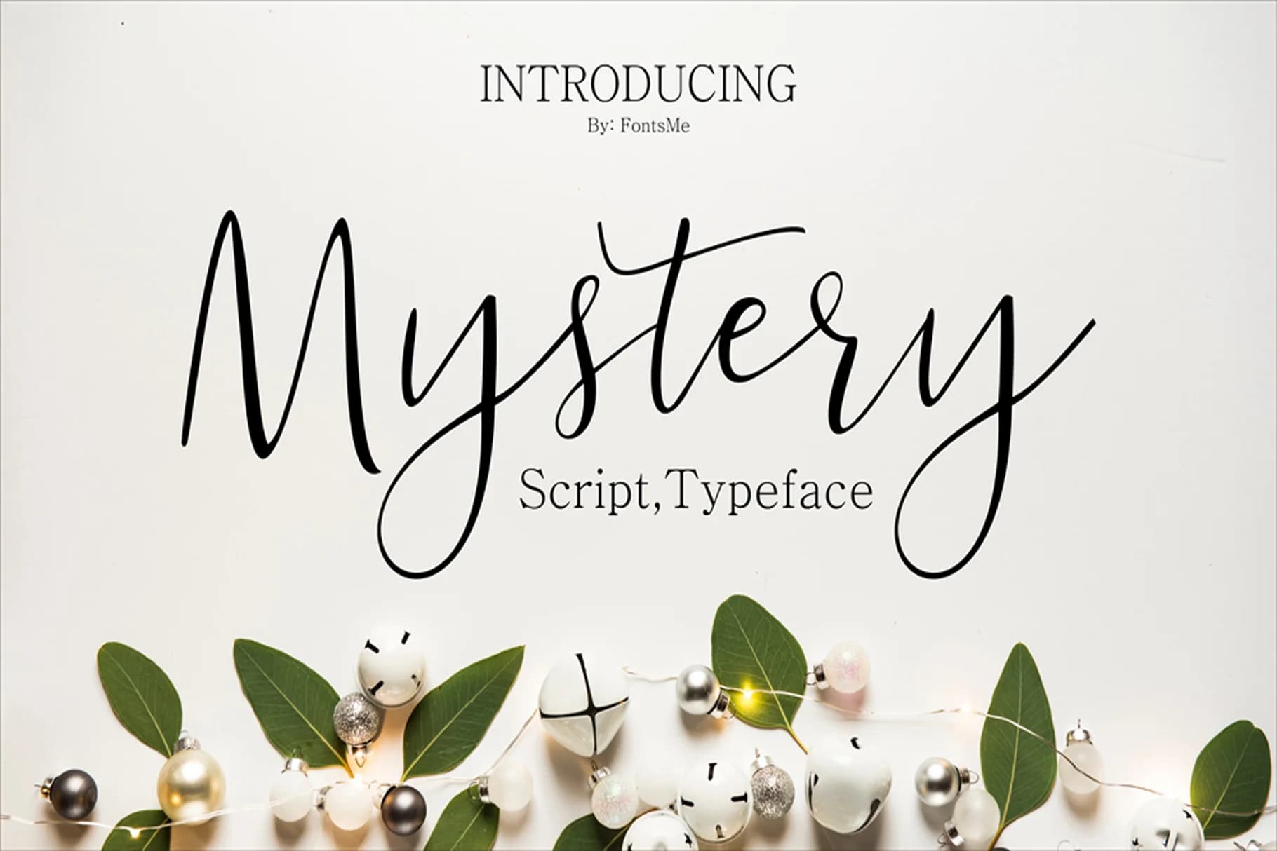
Mystery Font by ed.creative is a flowing calligraphic typeface that captures the elegance of handwritten letterforms with refined, graceful strokes. The font's thoughtfully executed curves give it a sophisticated character that stands apart from typical script families, making it an excellent choice for designers seeking something with both personality and polish.
This script excels in specialized applications where refined aesthetics matter. Consider using Mystery for high-end wedding invitation suites that demand an authentic handwritten feel, luxury cosmetics and skincare branding that conveys artisanal quality, custom monogram designs for personalized stationery, and upscale restaurant menus or wine labels seeking visual distinction. The complete character set includes both uppercase and lowercase letters, providing flexibility for varied layout approaches.
The typeface works particularly well at larger sizes where its nuanced letterforms can truly shine, though it maintains readability across different applications. Whether you're designing boutique invitations, crafting ornate social media graphics, or developing a premium brand identity, Mystery brings an authentic hand-lettered quality that feels personal without sacrificing professionalism. Get Mystery Font on Creative Fabrica and add sophisticated calligraphy to your design toolkit.
Style & Use Cases
- Overall Style
- Elegant, Flowing, Mystery
- Use Case
- Invitations, Branding
- Ideal For
- wedding stationery, greeting cards, and signatures
- Pairs With
- a simple uppercase sans
How to Install Mystery Font Font
Step-by-step instructions for every platform
- 1Download the Mystery Font font file (.ttf or .otf).
- 2Locate the downloaded file in your Downloads folder.
- 3Right-click the font file.
- 4Select "Install" to install for the current user, or "Install for all users" to make it available system-wide.
- 5Mystery Font is now available in Word, Photoshop, Illustrator, and all other apps.
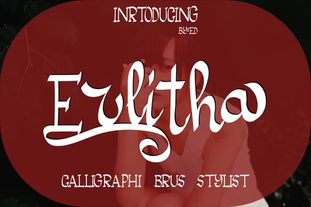
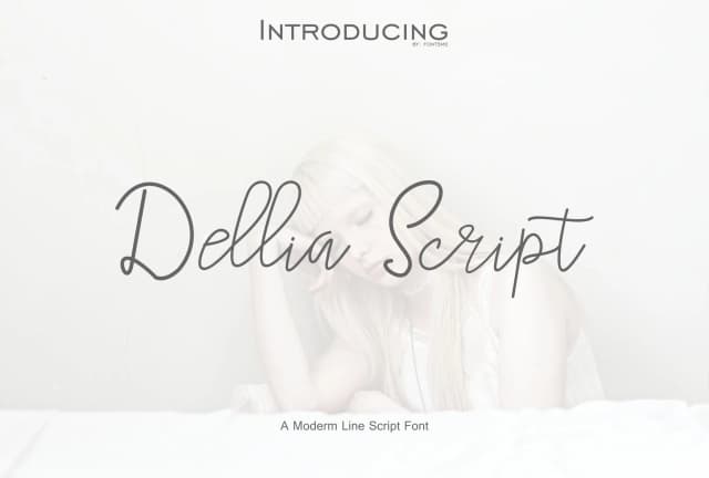
More by ed.creative
View all →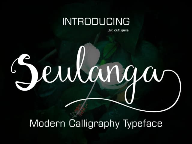
Browse fonts by theme
Curated collections →Saw a font in a picture? Identify any font from an image with our free Font Finder.
More Script Handwritten Fonts
Browse all →







What pairs well with Mystery Font?
Mystery Font is a script font that shines as a display or heading face. Pair it with a clean sans-serif or serif font for body text — the contrast creates a clear hierarchy while the two styles stay balanced and easy to read.



Mystery Font
by ed.creative
Reviewed by the FontBoxDL team · Updated May 2026