 Firefox
 1 / 9
1 / 9About Love Quake Font
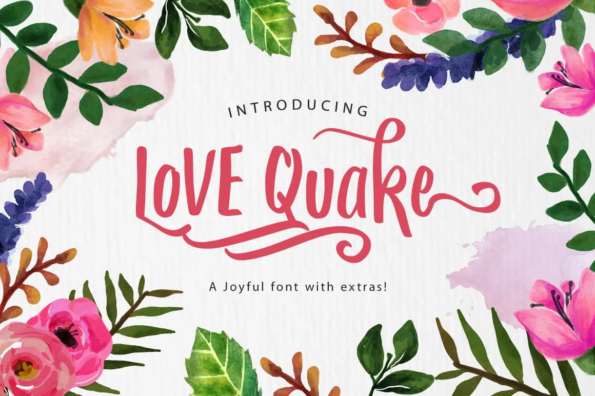
Love Quake by Arterfak Project is a brushed handwritten script that captures the organic essence of watercolor painting merged with Arts and Crafts movement aesthetics. Every letter has been hand traced to preserve the authentic flow of traditional brush lettering, while decorative swashes add expressive flourishes throughout the character set. The font's characteristic bounce creates an unmistakably spirited, approachable voice that feels both personal and polished.
This versatile script excels across creative applications that demand genuine character. Designers particularly value it for wedding invitation suites and save-the-date cards, building cohesive branding systems for artisanal businesses and handmade product labels, and creating custom event stationery such as place cards and menu designs. The supplementary swashes offer flexibility for decorative purposes including greeting card layouts, personalized gift tags, and hand-lettered signage. Whether used for social media graphics, scrapbooking projects, or vintage-style packaging for independent retailers, Love Quake delivers the unmistakable warmth of authentic brushwork.
The combination of handcrafted authenticity and versatile design makes Love Quake an ideal choice for creatives seeking genuine human character in their work. Discover this hand-traced typeface on Creative Fabrica and incorporate its distinctive brush-stroke appeal into your next creative project.
Style & Use Cases
- Overall Style
- Elegant, Flowing, Love Quake
- Use Case
- Invitations, Branding
- Ideal For
- wedding stationery, greeting cards, and signatures
- Pairs With
- a simple uppercase sans
How to Install Love Quake Font Font
Step-by-step instructions for every platform
- 1Download the Love Quake Font font file (.ttf or .otf).
- 2Locate the downloaded file in your Downloads folder.
- 3Right-click the font file.
- 4Select "Install" to install for the current user, or "Install for all users" to make it available system-wide.
- 5Love Quake Font is now available in Word, Photoshop, Illustrator, and all other apps.
More by Arterfak Project
View all →



Browse fonts by theme
Curated collections →Saw a font in a picture? Identify any font from an image with our free Font Finder.
More Script Handwritten Fonts
Browse all →







What pairs well with Love Quake Font?
Love Quake Font is a script font that shines as a display or heading face. Pair it with a clean sans-serif or serif font for body text — the contrast creates a clear hierarchy while the two styles stay balanced and easy to read.



Love Quake Font
Reviewed by the FontBoxDL team · Updated May 2026