 Firefox
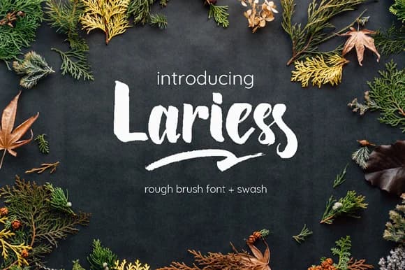 1 / 7
1 / 7About Lariess Font
Lariess by Astageni is a fluid brush script with organic, hand-painted character that brings authentic artistic flair to contemporary designs. Created through a meticulous process of painting letterforms on physical paper before precise digital translation, this typeface captures the spontaneity of handwork while maintaining the consistency needed for professional applications. The organic stroke variations and flowing baseline movements make it particularly suited for upscale wedding stationery, artisanal product packaging design, creative business cards, and sophisticated event graphics where genuine character matters as much as legibility. Beyond its visual appeal, Lariess functions beautifully across both display and accent roles, working well in combination with more structured typefaces to create compelling visual hierarchy. Its painterly texture and natural variations lend themselves to projects where personal touch and genuine craftsmanship serve as real marketing assets, from indie cosmetic and skincare brands to carefully curated social media content to hand-lettered environmental signage and design work. Each letter carries the weight of its artistic origins, distinguishing work that needs to break through crowded design spaces with genuine human warmth and character. Bring the hand-painted elegance of Lariess into your creative toolkit on Creative Fabrica, where this distinctive brush script awaits your next design project.
Style & Use Cases
- Overall Style
- Elegant, Flowing, Lariess
- Use Case
- Invitations, Branding
- Ideal For
- wedding stationery, greeting cards, and signatures
- Pairs With
- a simple uppercase sans
How to Install Lariess Font Font
Step-by-step instructions for every platform
- 1Download the Lariess Font font file (.ttf or .otf).
- 2Locate the downloaded file in your Downloads folder.
- 3Right-click the font file.
- 4Select "Install" to install for the current user, or "Install for all users" to make it available system-wide.
- 5Lariess Font is now available in Word, Photoshop, Illustrator, and all other apps.
More by Astageni
View all →

Browse fonts by theme
Curated collections →Saw a font in a picture? Identify any font from an image with our free Font Finder.
More Script Handwritten Fonts
Browse all →







What pairs well with Lariess Font?
Lariess Font is a script font that shines as a display or heading face. Pair it with a clean sans-serif or serif font for body text — the contrast creates a clear hierarchy while the two styles stay balanced and easy to read.



Lariess Font
by Astageni
Reviewed by the FontBoxDL team · Updated May 2026