 Firefox
About Kokan Font
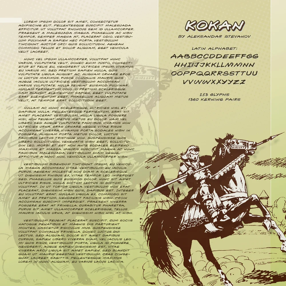
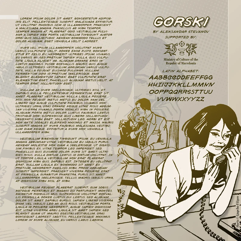
Kokan by astevanov is a playful handwritten script with vibrant cartoon energy that transforms design work with personality and charm. The font's dynamic, expressive letterforms excel in contexts where personality and visual impact matter most. Comic book speech bubbles, children's book illustrations, sticker sheet designs, and greeting card collections all showcase what this font does best: inject humor and liveliness into layouts with unmistakable character. The hand-drawn aesthetic creates genuine warmth while remaining highly legible across display and body sizes.
The font skillfully bridges the gap between structured typography and authentic handwriting, developing an approachable feel that connects with audiences regardless of age. Whether you're designing playful board game packaging, creating vibrant brand messaging for family-focused businesses, or developing animated motion graphics, Kokan delivers consistent visual interest without sacrificing clarity or readability. The energetic, expressive strokes work equally well as eye-catching packaging headlines or as charming secondary type in illustrated narratives and editorial design spreads.
Bring Kokan into your design collection and discover how spirited, characterful typography can enhance work that truly aims to entertain and engage. Get this font on Creative Fabrica and start creating with renewed playfulness and visual energy.
Style & Use Cases
- Overall Style
- Elegant, Flowing, Kokan
- Use Case
- Invitations, Branding
- Ideal For
- wedding stationery, greeting cards, and signatures
- Pairs With
- a simple uppercase sans
How to Install Kokan Font Font
Step-by-step instructions for every platform
- 1Download the Kokan Font font file (.ttf or .otf).
- 2Locate the downloaded file in your Downloads folder.
- 3Right-click the font file.
- 4Select "Install" to install for the current user, or "Install for all users" to make it available system-wide.
- 5Kokan Font is now available in Word, Photoshop, Illustrator, and all other apps.
More by astevanov
View all →
Browse fonts by theme
Curated collections →Saw a font in a picture? Identify any font from an image with our free Font Finder.
More Script Handwritten Fonts
Browse all →
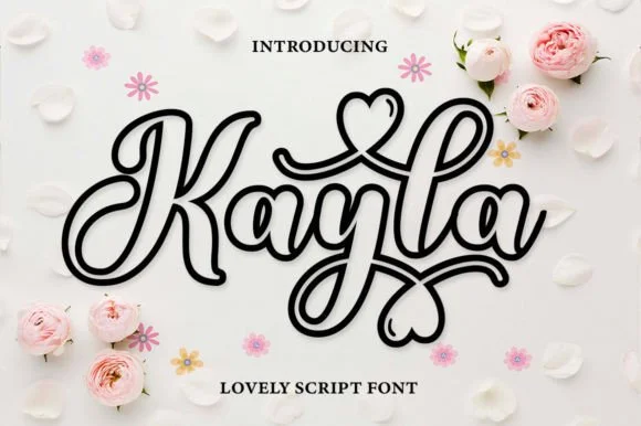
What pairs well with Kokan Font?
Kokan Font is a script font that shines as a display or heading face. Pair it with a clean sans-serif or serif font for body text — the contrast creates a clear hierarchy while the two styles stay balanced and easy to read.

Kokan Font
by astevanov
Reviewed by the FontBoxDL team · Updated May 2026