 Firefox
 1 / 3
1 / 3About June Apple Font
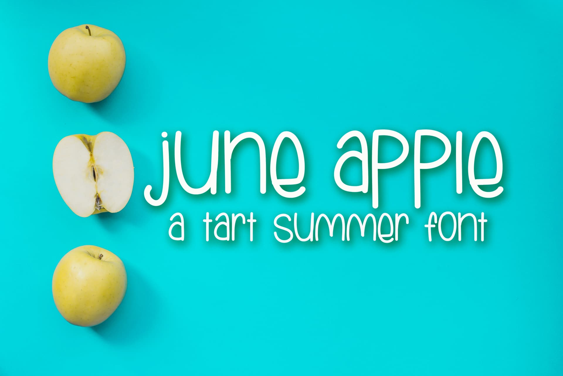
June Apple Font by Peace Love Craft is a charming hand-lettered script designed with playful energy and childlike warmth. The friendly letterforms capture an organic, drawn-by-hand quality that resonates with anyone creating designs for children or seeking a lighthearted aesthetic.
This font shines in contexts where authenticity and whimsy truly matter. Parents and creative professionals reach for it to design personalized children's birthday invitation suites, custom nursery wall decals with inspiring quotes, and thoughtful baby shower cards that feel genuinely personal. Small business owners and independent makers apply it to children's book illustrations and DIY craft room signage that stands out from mass-produced alternatives. The script works beautifully for personalized baby gift tags, custom clothing labels for children's apparel brands, and bespoke event stationery that captures individual character.
The font's playful letterforms are equally effective for custom merchandise, mug designs, greeting cards, and craft projects where personality matters more than polish. Whether you're creating gifts, building a niche children's product line, celebrating special occasions, or adding warmth to creative projects, this typeface brings genuine heart to your work. Bring June Apple Font into your design toolkit through Creative Fabrica.
Style & Use Cases
- Overall Style
- Elegant, Flowing, June Apple
- Use Case
- Invitations, Branding
- Ideal For
- wedding stationery, greeting cards, and signatures
- Pairs With
- a simple uppercase sans
How to Install June Apple Font Font
Step-by-step instructions for every platform
- 1Download the June Apple Font font file (.ttf or .otf).
- 2Locate the downloaded file in your Downloads folder.
- 3Right-click the font file.
- 4Select "Install" to install for the current user, or "Install for all users" to make it available system-wide.
- 5June Apple Font is now available in Word, Photoshop, Illustrator, and all other apps.
More by Peace Love Craft
View all →

Browse fonts by theme
Curated collections →Saw a font in a picture? Identify any font from an image with our free Font Finder.
More Script Handwritten Fonts
Browse all →







What pairs well with June Apple Font?
June Apple Font is a script font that shines as a display or heading face. Pair it with a clean sans-serif or serif font for body text — the contrast creates a clear hierarchy while the two styles stay balanced and easy to read.



June Apple Font
Reviewed by the FontBoxDL team · Updated May 2026