 Firefox
 1 / 2
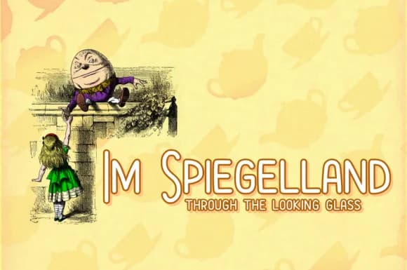
1 / 2About Im Spiegelland Font
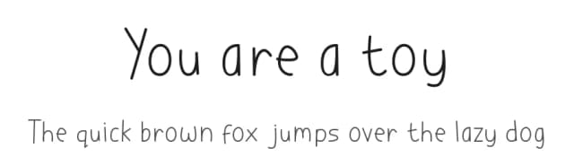
Im Spiegelland Font by Chequered Ink is a charming handwritten script that brings playful character and warmth to creative projects of all kinds. The distinctive mix of tall and short capitals creates dynamic visual interest and personality, making it stand out in designs where authentic, handcrafted aesthetics truly matter. This typeface excels in greeting card designs, handmade gift label creation, scrapbooking and mixed media layouts, and personalized stationery that requires genuine warmth and character. The varied letterforms flow with a natural rhythm, feeling less corporate and more intimate than standard typefaces, making it particularly effective when establishing a personal connection with your audience. The casual, unpolished quality of the letters brings a welcoming, approachable sensibility to any composition, inviting readers to slow down and appreciate the human touch behind the design.
Whether you're designing wedding invitations with DIY charm, creating Etsy product labels, or adding a personal touch to small business packaging, Im Spiegelland offers the authentic touch that contemporary brands increasingly seek. The font's organic quality works especially well for anyone moving away from sterile, corporate typefaces toward something with genuine human warmth and personality.
Get Im Spiegelland Font on Creative Fabrica to bring character and authenticity to your next design project.
Style & Use Cases
- Overall Style
- Elegant, Flowing, Im Spiegelland
- Use Case
- Invitations, Branding
- Ideal For
- wedding stationery, greeting cards, and signatures
- Pairs With
- a simple uppercase sans
How to Install Im Spiegelland Font Font
Step-by-step instructions for every platform
- 1Download the Im Spiegelland Font font file (.ttf or .otf).
- 2Locate the downloaded file in your Downloads folder.
- 3Right-click the font file.
- 4Select "Install" to install for the current user, or "Install for all users" to make it available system-wide.
- 5Im Spiegelland Font is now available in Word, Photoshop, Illustrator, and all other apps.
More by Chequered Ink
View all →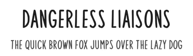
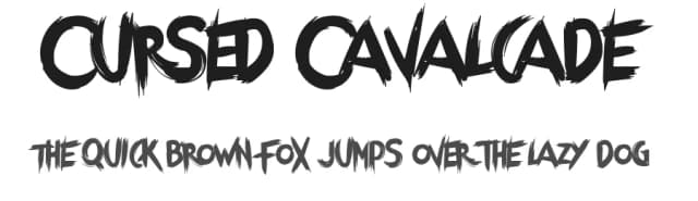
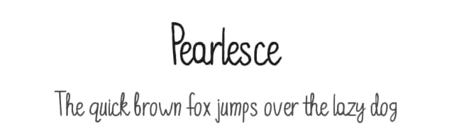
Browse fonts by theme
Curated collections →Saw a font in a picture? Identify any font from an image with our free Font Finder.
More Script Handwritten Fonts
Browse all →







What pairs well with Im Spiegelland Font?
Im Spiegelland Font is a script font that shines as a display or heading face. Pair it with a clean sans-serif or serif font for body text — the contrast creates a clear hierarchy while the two styles stay balanced and easy to read.



Im Spiegelland Font
Reviewed by the FontBoxDL team · Updated May 2026