 Firefox
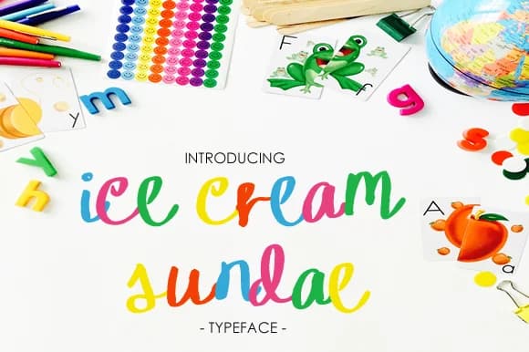
About Ice Cream Sundae Font
Ice Cream Sundae Font by yh.seaofknowledge is a whimsical, playful script that captures the joy and nostalgia of summertime indulgence with genuine character and flair. This handwritten-style typeface brings personality and warmth to seasonal and celebratory projects that celebrate the carefree spirit of warm weather and vacation vibes. Whether you're designing ice cream shop menus and window signage, creating invitations for summer celebrations, or crafting dessert cafe branding and frozen treat packaging, this font adds a lighthearted character that delights viewers and communicates joy with ease.
The fluid letterforms and bouncy personality make it especially effective for projects targeting families and children of all ages, from picture book covers to DIY craft projects, scrapbooking layouts, and special occasion cards. Its approachable warmth works equally well across digital and printed applications, providing practical versatility across diverse design contexts and media types. The script's natural flow ensures strong readability at various sizing scales, letting you confidently apply it to headlines, subheadings, body text treatments, and decorative flourishes throughout your composition.
Discover Ice Cream Sundae Font on Creative Fabrica and bring sweet, summery character and charm to your next creative project or design adventure.
Style & Use Cases
- Overall Style
- Elegant, Flowing, Ice Cream Sundae
- Use Case
- Invitations, Branding
- Ideal For
- wedding stationery, greeting cards, and signatures
- Pairs With
- a simple uppercase sans
How to Install Ice Cream Sundae Font Font
Step-by-step instructions for every platform
- 1Download the Ice Cream Sundae Font font file (.ttf or .otf).
- 2Locate the downloaded file in your Downloads folder.
- 3Right-click the font file.
- 4Select "Install" to install for the current user, or "Install for all users" to make it available system-wide.
- 5Ice Cream Sundae Font is now available in Word, Photoshop, Illustrator, and all other apps.
More by yh.seaofknowledge
View all →
Browse fonts by theme
Curated collections →Saw a font in a picture? Identify any font from an image with our free Font Finder.
More Script Handwritten Fonts
Browse all →







What pairs well with Ice Cream Sundae Font?
Ice Cream Sundae Font is a script font that shines as a display or heading face. Pair it with a clean sans-serif or serif font for body text — the contrast creates a clear hierarchy while the two styles stay balanced and easy to read.



Ice Cream Sundae Font
Reviewed by the FontBoxDL team · Updated May 2026