 Firefox
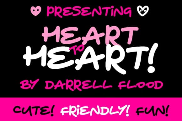
About Heart to Heart Font
Heart to Heart Font by Dadiomouse is a chunky, expressive handwritten marker typeface that captures the warmth and personality of hand-drawn lettering. The loose, playful strokes and generous weight give it a distinctly casual, approachable feel, making it an ideal choice for projects that call for genuine human touch and emotional resonance.
What sets this font apart is the charming collection of decorative heart elements included with the typeface, making it perfect for romance-focused and love-themed designs. The generous stroke weight ensures strong readability at any size, while the friendly letterforms adapt naturally to countless creative applications. This font excels for creating Valentine's Day greeting cards, designing personalized wedding invitation suites, crafting DIY anniversary gift tags, and developing nurturing children's book illustrations. The handwritten aesthetic translates beautifully to scrapbooking layouts, handmade product packaging for gift-oriented brands, and social media graphics celebrating relationships and life's cherished moments.
The authentic, character-rich nature of this typeface makes it invaluable for designers seeking typography that conveys sincerity without sacrificing legibility. Explore Heart to Heart Font on Creative Fabrica and bring genuine warmth to your creative work.
Style & Use Cases
- Overall Style
- Elegant, Flowing, Heart To Heart
- Use Case
- Invitations, Branding
- Ideal For
- wedding stationery, greeting cards, and signatures
- Pairs With
- a simple uppercase sans
How to Install Heart to Heart Font Font
Step-by-step instructions for every platform
- 1Download the Heart to Heart Font font file (.ttf or .otf).
- 2Locate the downloaded file in your Downloads folder.
- 3Right-click the font file.
- 4Select "Install" to install for the current user, or "Install for all users" to make it available system-wide.
- 5Heart to Heart Font is now available in Word, Photoshop, Illustrator, and all other apps.
More by Dadiomouse
View all →
Browse fonts by theme
Curated collections →Saw a font in a picture? Identify any font from an image with our free Font Finder.
More Script Handwritten Fonts
Browse all →







What pairs well with Heart to Heart Font?
Heart to Heart Font is a script font that shines as a display or heading face. Pair it with a clean sans-serif or serif font for body text — the contrast creates a clear hierarchy while the two styles stay balanced and easy to read.



Heart to Heart Font
by Dadiomouse
Reviewed by the FontBoxDL team · Updated May 2026