 Firefox
 1 / 8
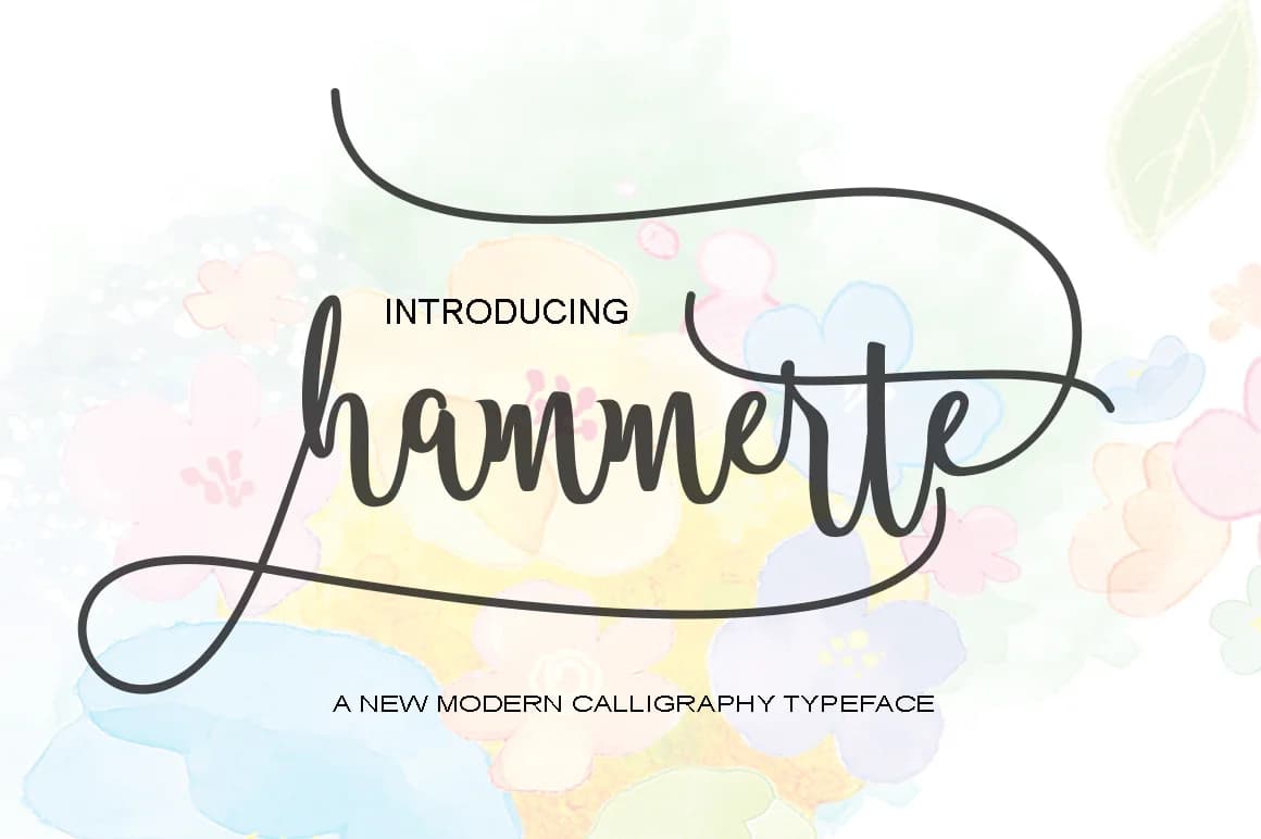
1 / 8About Hammerte Font
Hammerte by Polem is a flowing handwritten script that brings genuine warmth and authentic personality into any creative work. The typeface features naturally expressive letterforms that skillfully capture the irregular beauty of pen on paper, delivering both handcrafted character and reliable legibility across digital and print applications.
This script thrives in intimate, personal design contexts where authenticity and human connection genuinely matter. Consider it for wedding invitation suites where you want guests to feel the thoughtfulness behind each detail. It works beautifully for custom greeting card designs, artisan product labeling and packaging that demand visual attention, hand-drawn restaurant menus that add character to dining experiences, or branding for independent boutique creators. The font's organic flowing nature also suits lifestyle content, social media graphics, and merchandise designs where genuine personality and warmth outweigh corporate formality.
Hammerte includes multiple character weights and alternate glyph variations, providing flexibility in styling and visual expression. The font integrates seamlessly with major design software and vinyl cutting applications, removing friction from concept through production and final use. Bring Hammerte to your design collection on Creative Fabrica and discover how this script font can enhance your next project.
Style & Use Cases
- Overall Style
- Elegant, Flowing, Hammerte
- Use Case
- Invitations, Branding
- Ideal For
- wedding stationery, greeting cards, and signatures
- Pairs With
- a simple uppercase sans
How to Install Hammerte Font Font
Step-by-step instructions for every platform
- 1Download the Hammerte Font font file (.ttf or .otf).
- 2Locate the downloaded file in your Downloads folder.
- 3Right-click the font file.
- 4Select "Install" to install for the current user, or "Install for all users" to make it available system-wide.
- 5Hammerte Font is now available in Word, Photoshop, Illustrator, and all other apps.
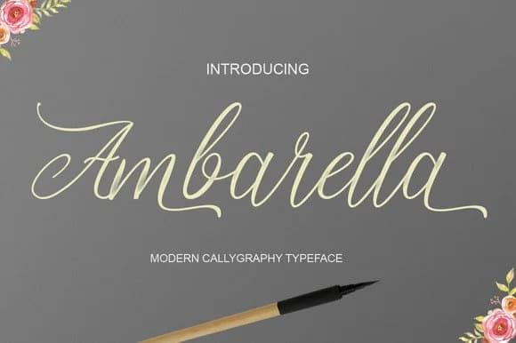
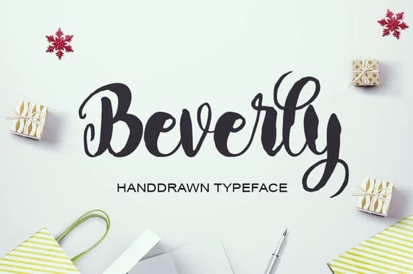
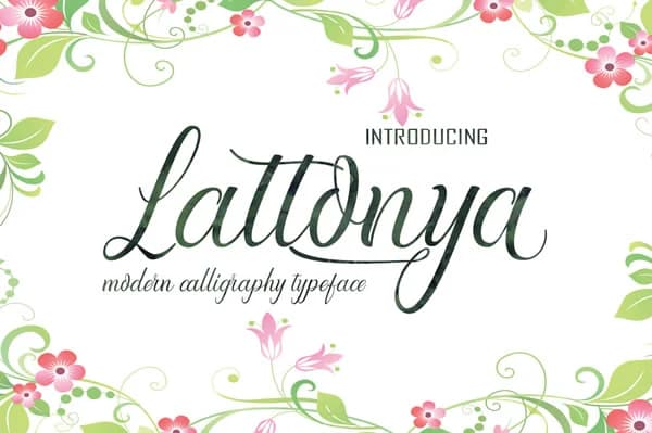
Browse fonts by theme
Curated collections →Saw a font in a picture? Identify any font from an image with our free Font Finder.
More Script Handwritten Fonts
Browse all →







What pairs well with Hammerte Font?
Hammerte Font is a script font that shines as a display or heading face. Pair it with a clean sans-serif or serif font for body text — the contrast creates a clear hierarchy while the two styles stay balanced and easy to read.



Hammerte Font
by Polem
Reviewed by the FontBoxDL team · Updated May 2026