 Firefox
 1 / 6
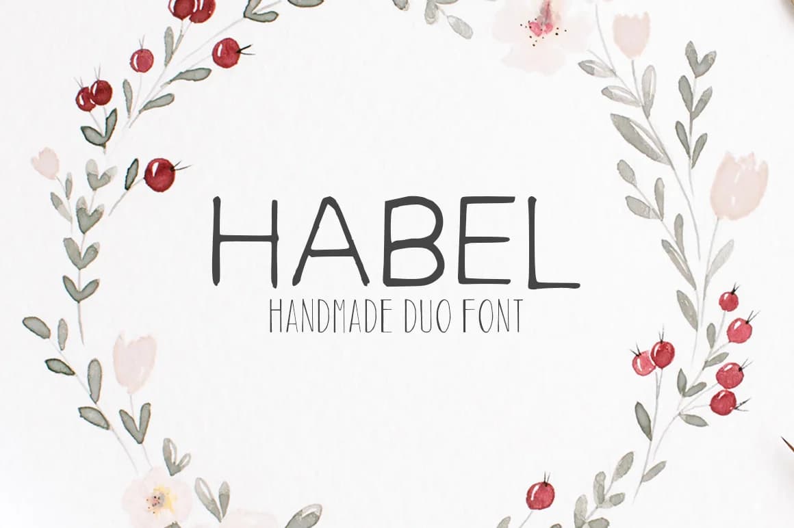
1 / 6About Habel Font
Habel by creativetacos is a handwritten script collection that combines two complementary typefaces designed to work beautifully together or independently. This dual-font pairing brings authentic, brushed letterforms to projects seeking warmth and human character. The interplay between Habel and its companion Adouliss opens creative possibilities for layered typography while maintaining visual cohesion across your work. This font pairing shines when designing personalized wedding invitation suites where one style can anchor the main text while the other adds elegant detail. Artisanal brands creating packaging for handmade cosmetics, small-batch goods, or boutique skincare products find these script styles perfect for communicating authenticity and craft. Content creators leverage the pairing for lifestyle social media graphics with handwritten-style text overlays, while DIY makers and designers use it for creating custom printable signs, stickers, and labels that need genuine character without losing readability. The beauty of this collection lies in its flexibility, each font holds its own personality, yet together they reinforce a cohesive visual identity. Whether you're building a single-font composition or layering both styles, the pair adapts to your vision. Get Habel and Adouliss from Creative Fabrica and unlock a handwritten aesthetic for your next project.
Style & Use Cases
- Overall Style
- Elegant, Flowing, Habel
- Use Case
- Invitations, Branding
- Ideal For
- wedding stationery, greeting cards, and signatures
- Pairs With
- a simple uppercase sans
How to Install Habel Font Font
Step-by-step instructions for every platform
- 1Download the Habel Font font file (.ttf or .otf).
- 2Locate the downloaded file in your Downloads folder.
- 3Right-click the font file.
- 4Select "Install" to install for the current user, or "Install for all users" to make it available system-wide.
- 5Habel Font is now available in Word, Photoshop, Illustrator, and all other apps.
More by creativetacos
View all →
Browse fonts by theme
Curated collections →Saw a font in a picture? Identify any font from an image with our free Font Finder.
More Script Handwritten Fonts
Browse all →







What pairs well with Habel Font?
Habel Font is a script font that shines as a display or heading face. Pair it with a clean sans-serif or serif font for body text — the contrast creates a clear hierarchy while the two styles stay balanced and easy to read.



Habel Font
Reviewed by the FontBoxDL team · Updated May 2026