 Firefox
 1 / 9
1 / 9About Grumpys Font
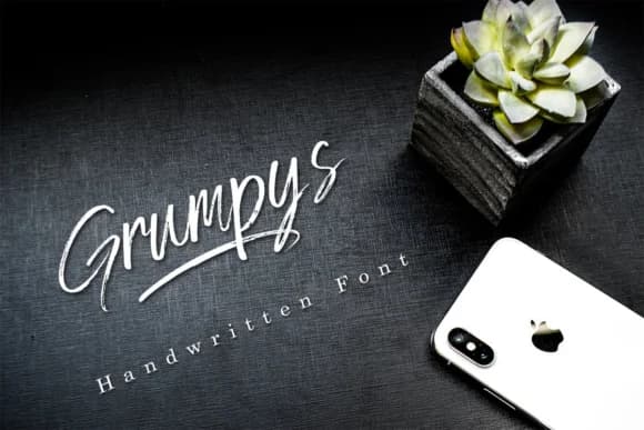
Grumpys by youthlabs is a textured handwritten script that brings attitude and contemporary personality to design projects needing distinctive character. With its raw, expressive strokes balanced by surprisingly refined proportions, this font bridges casual energy and polished sophistication, working equally well in edgy branding contexts or refined editorial applications. The font performs exceptionally well for wedding invitation suites, where its gritty elegance adds memorable personality to formal announcements. It's equally suited for artisanal cosmetics packaging design, where textured letterforms enhance authentic brand appeal and catch eyes on retail shelves. Independent designers select Grumpys for distinctive logo work and wordmark creation when brands need genuine handwritten character. The script also excels for book cover lettering in self-help and memoir categories, where readers respond to authentic, imperfect design aesthetics. Beyond print work, Grumpys translates seamlessly to digital applications, from lifestyle blog headers and social media graphics to promotional content for boutique businesses. Its versatility as both a standalone display typeface and layering element in visual composition gives designers multiple creative directions. Find Grumpys Font on Creative Fabrica and add this distinctive handwritten script to your design toolkit.
Style & Use Cases
- Overall Style
- Elegant, Flowing, Grumpys
- Use Case
- Invitations, Branding
- Ideal For
- wedding stationery, greeting cards, and signatures
- Pairs With
- a simple uppercase sans
How to Install Grumpys Font Font
Step-by-step instructions for every platform
- 1Download the Grumpys Font font file (.ttf or .otf).
- 2Locate the downloaded file in your Downloads folder.
- 3Right-click the font file.
- 4Select "Install" to install for the current user, or "Install for all users" to make it available system-wide.
- 5Grumpys Font is now available in Word, Photoshop, Illustrator, and all other apps.


Browse fonts by theme
Curated collections →Saw a font in a picture? Identify any font from an image with our free Font Finder.
More Script Handwritten Fonts
Browse all →







What pairs well with Grumpys Font?
Grumpys Font is a script font that shines as a display or heading face. Pair it with a clean sans-serif or serif font for body text — the contrast creates a clear hierarchy while the two styles stay balanced and easy to read.



Grumpys Font
by youthlabs
Reviewed by the FontBoxDL team · Updated May 2026