
 1 / 10
About Gromega Font
Gromega conjures the raw, defiant energy of underground metal aesthetics. Designed by Alit Design, this blackletter typeface weaves thorn-like edges and aggressive serifs into a font that pulls focus without a trace of apology or restraint.
The typeface contains 921 carefully crafted characters, providing genuine flexibility for intricate typographic work across varied contexts. Stylistic alternates and flowing ligatures let you compose richly layered letterforms that work beautifully for heavy metal album covers and EPs, tattoo flash sheet collections, band merchandise labeling and packaging, and alternative fashion lookbooks. Gothic wedding invitations and occult-themed product packaging also respond especially well to Gromega's unapologetic visual intensity. The extensive swash library adds dramatic flourishes to headers and standalone display compositions, transforming even minimal text into something visually commanding and genuinely hard to ignore. Built-in multilingual support means you can extend this aesthetic across language boundaries and reach global audiences without any compromise to the typeface's raw character or visual impact.
When pairing Gromega with extended body copy, choose a clean geometric sans-serif to maintain readability while letting the blackletter shine in its proper display role. Head to Creative Fabrica to add this typeface to your library and bring genuine visual edge to your next dark-leaning design project.
Style & Use Cases
- Overall Style
- Ornate, Gothic
- Use Case
- Logos, Certificates
- Ideal For
- medieval themes, band merch, and tattoo lettering
- Pairs With
- a clean sans-serif for body text
How to Install Gromega Font
Step-by-step instructions for every platform
- 1Download the Gromega font file (.ttf or .otf).
- 2Locate the downloaded file in your Downloads folder.
- 3Right-click the font file.
- 4Select "Install" to install for the current user, or "Install for all users" to make it available system-wide.
- 5Gromega is now available in Word, Photoshop, Illustrator, and all other apps.
More by Alit Design
View all →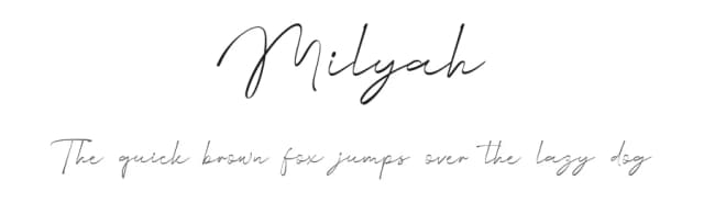
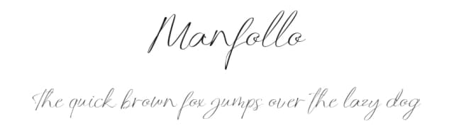
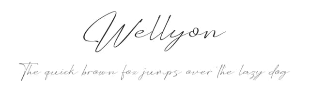
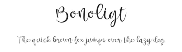
Browse fonts by theme
Curated collections →Saw a font in a picture? Identify any font from an image with our free Font Finder.
More Blackletter Fonts
Browse all →
What pairs well with Gromega Font?
Gromega Font is a blackletter font that shines as a display or heading face. Pair it with a clean serif or sans-serif font for body text — the contrast creates a clear hierarchy while the two styles stay balanced and easy to read.



Gromega Font
by Alit Design
Reviewed by the FontBoxDL team · Updated June 2026