 Firefox
 1 / 5
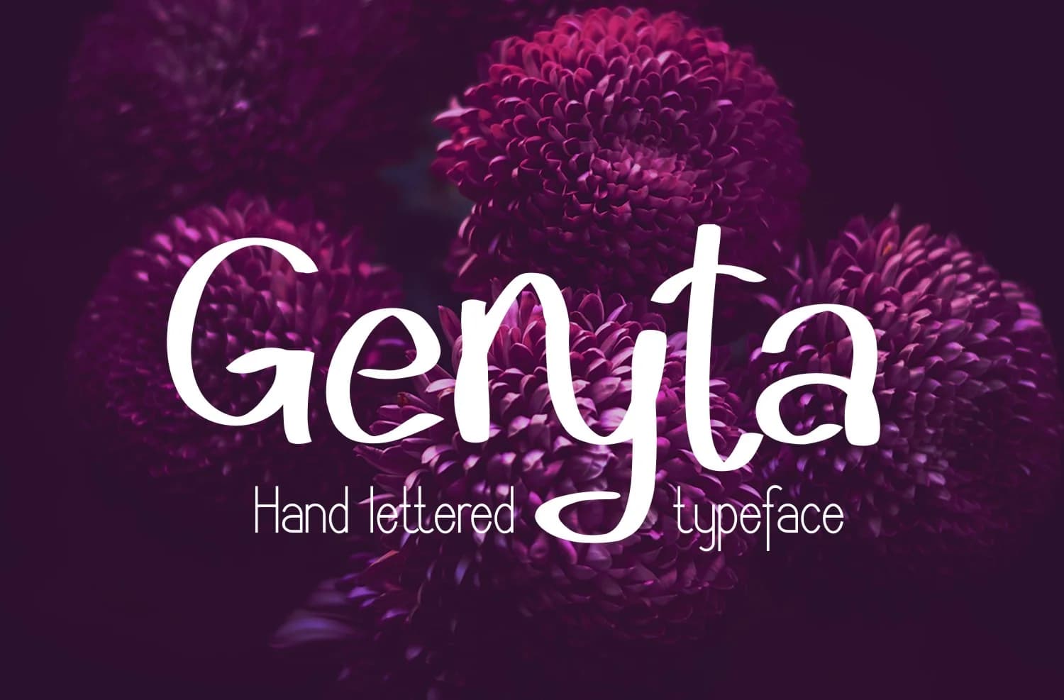
1 / 5About Geryta Font
Geryta by Digital Typeface Studio is a refined script font that balances elegant character with genuine versatility and everyday practicality. The design features fluid letterforms and carefully calibrated strokes that maintain clarity at both large and small sizes, making it suitable for everything from eye-catching headlines to readable body copy. With its measured proportions, consistent weight distribution, and clean finish, Geryta moves beyond purely decorative scripts to offer a font that works reliably in real-world design applications and professional contexts. Geryta shines for creating wedding invitation suites with timeless appeal, designing artisanal product labels for skincare and lifestyle brands, crafting boutique cosmetics packaging, and developing premium stationery systems. The font's balanced weight ensures professional results across diverse applications, whether you're working on large format event signage, wine labels, greeting cards, DIY craft projects, or boutique branding materials that require an air of refinement. Its comprehensive glyph set provides reliable support for multiple languages, making it valuable for designers working across international markets and diverse cultural contexts. The font's consistent letterforms work equally well when set tight for impact or spaced generously for elegance. Bring refined sophistication and character to your creative work by getting Geryta on Creative Fabrica.
Style & Use Cases
- Overall Style
- Elegant, Flowing, Geryta
- Use Case
- Invitations, Branding
- Ideal For
- wedding stationery, greeting cards, and signatures
- Pairs With
- a simple uppercase sans
How to Install Geryta Font Font
Step-by-step instructions for every platform
- 1Download the Geryta Font font file (.ttf or .otf).
- 2Locate the downloaded file in your Downloads folder.
- 3Right-click the font file.
- 4Select "Install" to install for the current user, or "Install for all users" to make it available system-wide.
- 5Geryta Font is now available in Word, Photoshop, Illustrator, and all other apps.
More by Digital Typeface Studio
View all →

Browse fonts by theme
Curated collections →Saw a font in a picture? Identify any font from an image with our free Font Finder.
More Script Handwritten Fonts
Browse all →







What pairs well with Geryta Font?
Geryta Font is a script font that shines as a display or heading face. Pair it with a clean sans-serif or serif font for body text — the contrast creates a clear hierarchy while the two styles stay balanced and easy to read.



Geryta Font
Reviewed by the FontBoxDL team · Updated May 2026