 Firefox
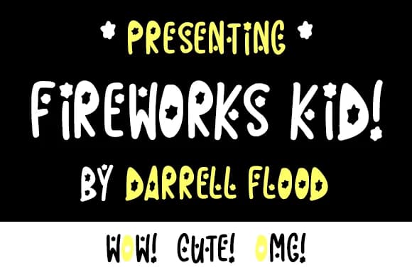
About Fireworks Kid Font
Fireworks Kid by Dadiomouse is a playful, marker-style handwritten script that brings bold personality to celebratory projects. With its thick, rounded letterforms and expressive character, this font captures the exuberant energy perfect for occasions worthy of extra visual flair.
This typeface truly shines on birthday party invitations and greeting cards, where its friendly character creates an immediate sense of joy for recipients. It works equally well on gift tags and favor labels, adding a cheerful touch to wrapped presents and party favors throughout the year. Celebration posters and event signage benefit from the font's high visibility and upbeat personality, making announcements pop on wall displays and bulletin boards with confidence. For card makers and scrapbooking enthusiasts, Fireworks Kid offers the hand-drawn authenticity that transforms ordinary projects into memorable keepsakes with genuine handcrafted character.
The font's generous letterforms ensure reliable legibility at various sizes while maintaining its signature playful spirit. Whether you're designing seasonal greeting card sets, custom announcement graphics, or festive signage, this marker-inspired typeface delivers warmth and excitement that resonates with audiences of all ages. Get Fireworks Kid on Creative Fabrica to start adding genuine handcrafted character to your celebratory designs.
Style & Use Cases
- Overall Style
- Elegant, Flowing, Fireworks Kid
- Use Case
- Invitations, Branding
- Ideal For
- wedding stationery, greeting cards, and signatures
- Pairs With
- a simple uppercase sans
How to Install Fireworks Kid Font Font
Step-by-step instructions for every platform
- 1Download the Fireworks Kid Font font file (.ttf or .otf).
- 2Locate the downloaded file in your Downloads folder.
- 3Right-click the font file.
- 4Select "Install" to install for the current user, or "Install for all users" to make it available system-wide.
- 5Fireworks Kid Font is now available in Word, Photoshop, Illustrator, and all other apps.
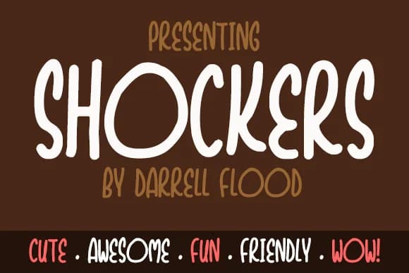
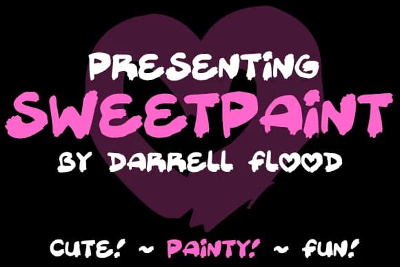
More by Dadiomouse
View all →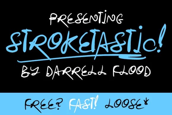
Browse fonts by theme
Curated collections →Saw a font in a picture? Identify any font from an image with our free Font Finder.
More Script Handwritten Fonts
Browse all →







What pairs well with Fireworks Kid Font?
Fireworks Kid Font is a script font that shines as a display or heading face. Pair it with a clean sans-serif or serif font for body text — the contrast creates a clear hierarchy while the two styles stay balanced and easy to read.



Fireworks Kid Font
by Dadiomouse
Reviewed by the FontBoxDL team · Updated May 2026