 Firefox
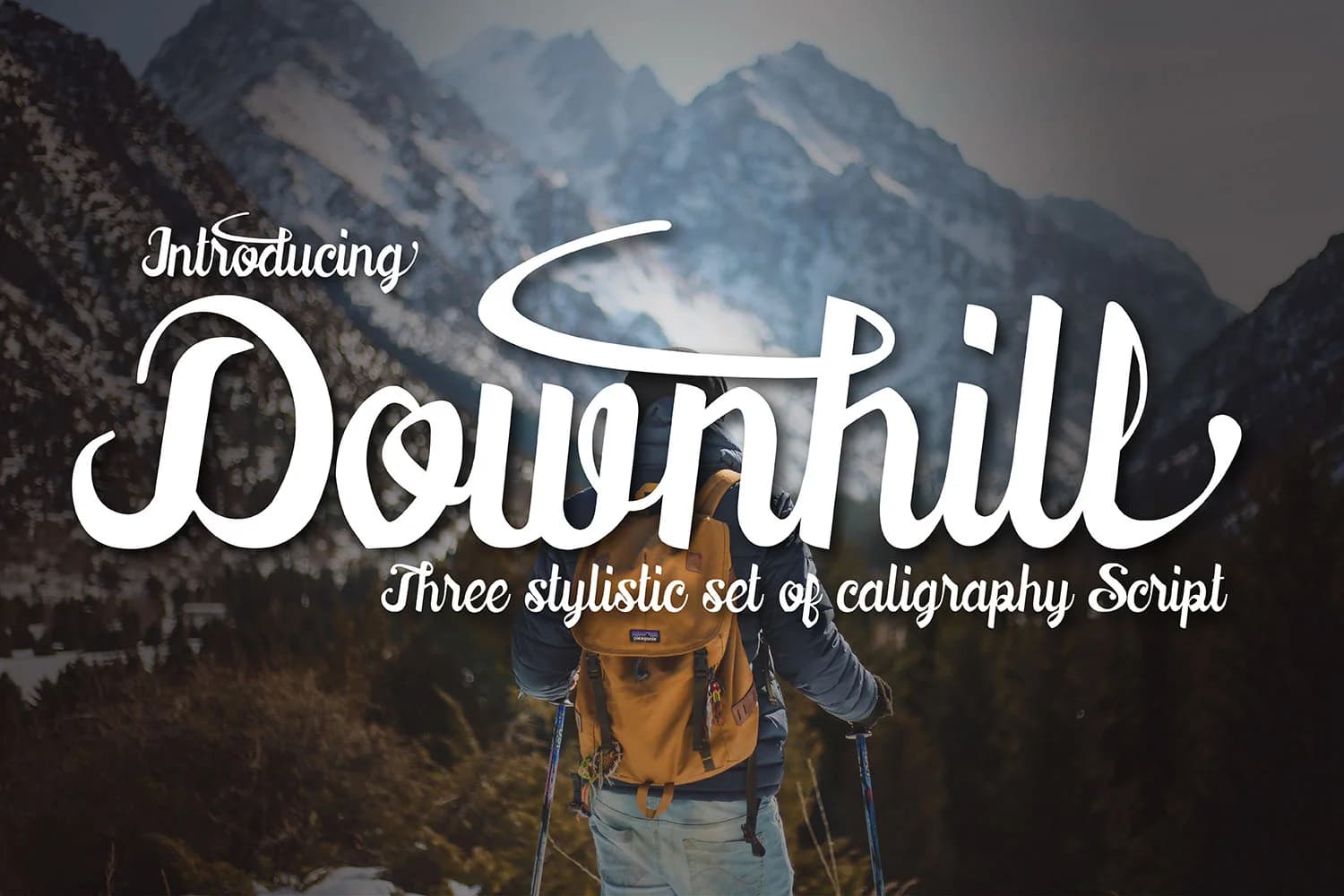 1 / 9
1 / 9About Downhill Font
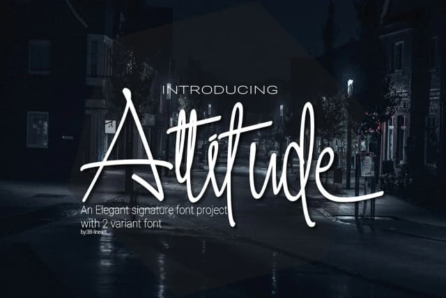
Downhill by 38.lineart is a fluid painterly script that brings artistic flair to contemporary design projects. The typeface features crisp, expressive letterforms with a handcrafted sensibility, making it an ideal choice for creating distinctive visual impact in headline text and logo design treatments. Its sophisticated character set works beautifully across diverse applications, from luxury packaging designs and boutique restaurant branding to upscale beauty product labels where typography becomes a key brand differentiator. The font's naturally elegant brush-like strokes translate exceptionally well to both digital displays and traditional print media.
The calligraphic qualities embedded within Downhill make it particularly well-suited for design projects requiring personality, refinement, and premium market positioning. Whether you're developing wedding invitation suites for upscale events, creating artist portfolio websites, designing Etsy shop branding, or establishing comprehensive brand identity systems for creative service businesses, this typeface delivers visual sophistication without sacrificing legibility at larger display sizes. The carefully crafted letterforms maintain readability even when scaled boldly, while the painterly finish adds memorable, distinctive character to any application.
Bring the refined artistry of Downhill into your next design project by accessing this distinctive typeface on Creative Fabrica.
Style & Use Cases
- Overall Style
- Elegant, Flowing, Downhill
- Use Case
- Invitations, Branding
- Ideal For
- wedding stationery, greeting cards, and signatures
- Pairs With
- a simple uppercase sans
How to Install Downhill Font Font
Step-by-step instructions for every platform
- 1Download the Downhill Font font file (.ttf or .otf).
- 2Locate the downloaded file in your Downloads folder.
- 3Right-click the font file.
- 4Select "Install" to install for the current user, or "Install for all users" to make it available system-wide.
- 5Downhill Font is now available in Word, Photoshop, Illustrator, and all other apps.
More by 38.lineart
View all →
Browse fonts by theme
Curated collections →Saw a font in a picture? Identify any font from an image with our free Font Finder.
More Script Handwritten Fonts
Browse all →







What pairs well with Downhill Font?
Downhill Font is a script font that shines as a display or heading face. Pair it with a clean sans-serif or serif font for body text — the contrast creates a clear hierarchy while the two styles stay balanced and easy to read.



Downhill Font
by 38.lineart
Reviewed by the FontBoxDL team · Updated May 2026