
 1 / 10
About Darksame Font
Darksame, designed by Alit Design, bridges two typographic worlds by combining the commanding weight and texture of blackletter with the refined structure of a serif typeface. The result is a typeface with real visual authority, where thick strokes and delicate serifs meet in elegant proportions that feel both contemporary and deeply rooted in classic letterpress tradition.
The font packs 701 characters and full support for Western European, Central European, South European, and Vietnamese languages, all built with OpenType features in mind. You get extensive alternates, ligatures, and swashes to work with when you're using software that supports them, like Illustrator, InDesign, and other professional design programs. The flexibility here lets you build custom letterforms within a single design, so each project ends up feeling intentional and crafted rather than generic or stock.
This typeface speaks to designers working on wedding invitation suites where formality matters, luxury brand packaging that needs substantial weight, illustrated book covers that demand strong character, and editorial layouts where typography itself becomes the focal point. Darksame works best for projects that aren't afraid of darkness and sophisticated detail, where audiences expect real craftsmanship and refinement. Find it on Creative Fabrica to add to your collection.
Style & Use Cases
- Overall Style
- Ornate, Gothic
- Use Case
- Logos, Certificates
- Ideal For
- medieval themes, band merch, and tattoo lettering
- Pairs With
- a clean sans-serif for body text
How to Install Darksame Font
Step-by-step instructions for every platform
- 1Download the Darksame font file (.ttf or .otf).
- 2Locate the downloaded file in your Downloads folder.
- 3Right-click the font file.
- 4Select "Install" to install for the current user, or "Install for all users" to make it available system-wide.
- 5Darksame is now available in Word, Photoshop, Illustrator, and all other apps.
More by Alit Design
View all →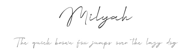
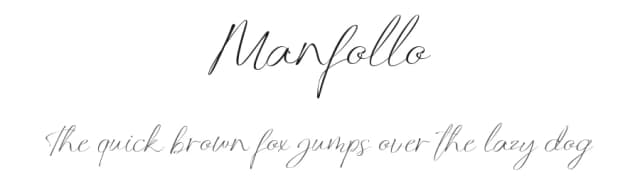
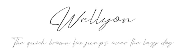
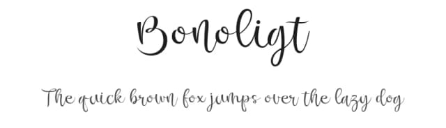
Browse fonts by theme
Curated collections →Saw a font in a picture? Identify any font from an image with our free Font Finder.
More Blackletter Fonts
Browse all →
What pairs well with Darksame Font?
Darksame Font is a blackletter font that shines as a display or heading face. Pair it with a clean serif or sans-serif font for body text — the contrast creates a clear hierarchy while the two styles stay balanced and easy to read.



Darksame Font
by Alit Design
Reviewed by the FontBoxDL team · Updated June 2026