 Firefox
 1 / 9
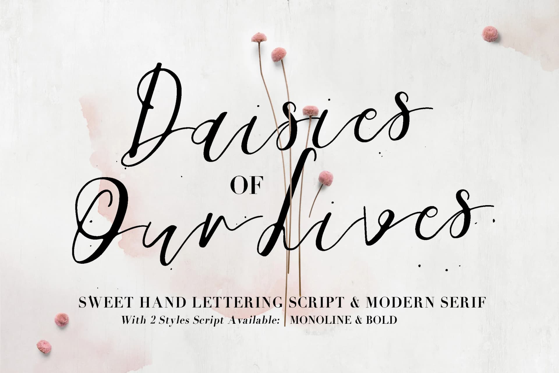
1 / 9About Daisies of Our Lives Font
Daisies of Our Lives by Blue Robin Design Shop is a hybrid script font that merges hand-lettered flourishes with refined serif construction. This versatile family works beautifully across contexts where personality and precision matter equally. Whether you're crafting intimate wedding invitation suites, designing custom thank-you cards, building brand identities for boutique businesses, or creating product labels for small-batch skincare lines, the font adapts gracefully. The two weight options, thin-monoline and bold, let you shift between delicate elegance and commanding presence within the same design system. The hand-lettered quality feels personal and approachable, while the serif elements maintain visual authority and polish. This balance makes it particularly effective for DIY craft signage, social media graphics that demand distinction, and lifestyle blog headers. The typeface works well when you want designs to feel both refined and human-made rather than corporate or sterile. Whether you're developing cohesive branding for creative entrepreneurs, personalizing invitation designs, or exploring unique visual identities across packaging and print, Daisies of Our Lives offers the character and technical range required. Find this distinctive font on Creative Fabrica and explore what dimensional elegance can bring to your work.
Style & Use Cases
- Overall Style
- Elegant, Flowing, Daisies Of Our Lives
- Use Case
- Invitations, Branding
- Ideal For
- wedding stationery, greeting cards, and signatures
- Pairs With
- a simple uppercase sans
How to Install Daisies of Our Lives Font Font
Step-by-step instructions for every platform
- 1Download the Daisies of Our Lives Font font file (.ttf or .otf).
- 2Locate the downloaded file in your Downloads folder.
- 3Right-click the font file.
- 4Select "Install" to install for the current user, or "Install for all users" to make it available system-wide.
- 5Daisies of Our Lives Font is now available in Word, Photoshop, Illustrator, and all other apps.
More by Blue Robin Design Shop
View all →
Browse fonts by theme
Curated collections →Saw a font in a picture? Identify any font from an image with our free Font Finder.
More Script Handwritten Fonts
Browse all →







What pairs well with Daisies of Our Lives Font?
Daisies of Our Lives Font is a script font that shines as a display or heading face. Pair it with a clean sans-serif or serif font for body text — the contrast creates a clear hierarchy while the two styles stay balanced and easy to read.



Daisies of Our Lives Font
Reviewed by the FontBoxDL team · Updated May 2026