
 1 / 6
1 / 6About CS Verity Font
Picture a hand-lettered wedding invitation where the opening line spirals into delicate vines. That's the energy of CS Verity, a display serif from Craft Supply Co. that takes Gothic structure and twists it into something more refined. The font's defining feature is its tendril-shaped letter terminals that coil and intertwine, creating an effect that's both classical and decorative rather than purely ornamental.
This typeface works beautifully for projects where you need presence without aggression. Heritage branding, historical manuscript covers, apothecary packaging, and ornate event stationery all benefit from its intricate letterforms. The curves flow naturally into one another, giving readers something to follow visually. Because the tendrils are consistent across the design, the font remains legible even at display sizes where other ornate faces would dissolve into decoration.
CS Verity shines when you want to signal craftsmanship and history without feeling dated. Use it for opening verses on wine labels, luxury product branding, or formal announcement cards. The font handles longer words better than you'd expect from something this detailed, making it versatile for both headlines and subheadings. Grab it on Creative Fabrica and start layering it into designs that need a touch of elegant complexity.
Style & Use Cases
- Overall Style
- Ornate, Gothic
- Use Case
- Logos, Certificates
- Ideal For
- medieval themes, band merch, and tattoo lettering
- Pairs With
- a clean sans-serif for body text
How to Install CS Verity Font
Step-by-step instructions for every platform
- 1Download the CS Verity font file (.ttf or .otf).
- 2Locate the downloaded file in your Downloads folder.
- 3Right-click the font file.
- 4Select "Install" to install for the current user, or "Install for all users" to make it available system-wide.
- 5CS Verity is now available in Word, Photoshop, Illustrator, and all other apps.
More by Craft Supply Co.
View all →
Browse fonts by theme
Curated collections →Saw a font in a picture? Identify any font from an image with our free Font Finder.
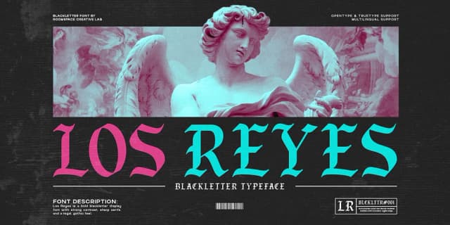
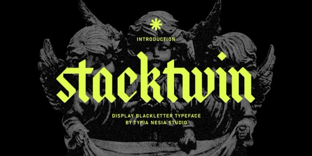
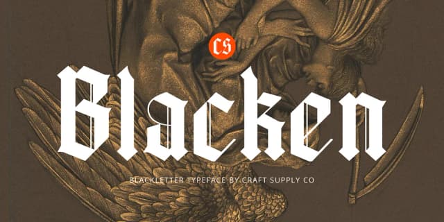
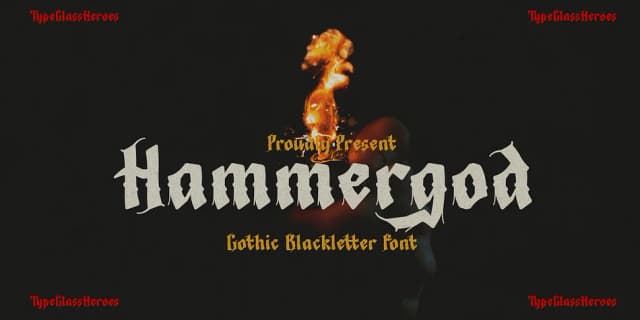
More Blackletter Fonts
Browse all →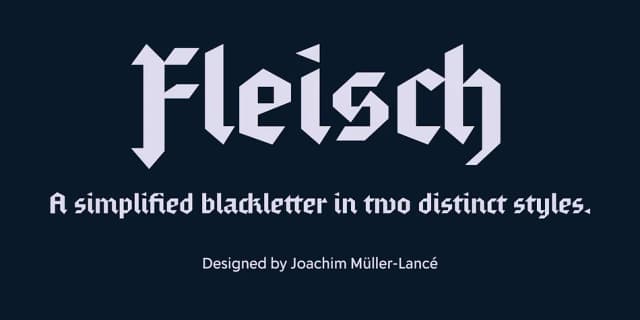
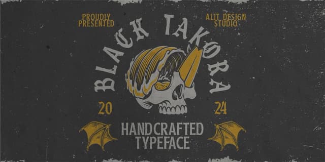
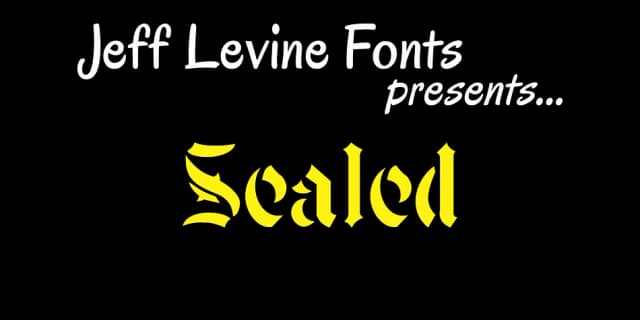
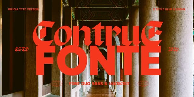
What pairs well with CS Verity Font?
CS Verity Font is a blackletter font that shines as a display or heading face. Pair it with a clean serif or sans-serif font for body text — the contrast creates a clear hierarchy while the two styles stay balanced and easy to read.



CS Verity Font
Reviewed by the FontBoxDL team · Updated June 2026