
 1 / 6
1 / 6About CS Falcone Font
CS Falcone by Craft Supply Co. trades modern curves for a sharp, commanding presence deeply rooted in medieval letterforms. Its angular construction and bold weight create stark vertical strokes that pull the eye downward with visible force, channeling the graphic drama of old Gothic architecture into contemporary design work. Each character feels carved rather than drawn, with an intensity that naturally suits projects demanding historical visual weight and genuine darkness.
This is the font for work that requires real impact and holds viewer attention. Horror movie title sequences feel at home here, as do metal and dark alternative album covers, witchy brand identities, and vintage concert posters. Gothic wedding invitations, haunted attraction signage, occult bookstore branding, and Victorian-inspired product packaging all take on distinct personality with these letterforms. Substantial weight paired with consistent blackletter DNA provides versatility across applications, holding its character from small labels all the way to large signage.
Designers building gothic or darkly elegant visual systems will find CS Falcone indispensable. It brings authentic historical character to any project craving depth beyond what standard typography can deliver. Grab it on Creative Fabrica to anchor your next album cover, poster, or branding project that needs real visual weight.
Style & Use Cases
- Overall Style
- Ornate, Gothic
- Use Case
- Logos, Certificates
- Ideal For
- medieval themes, band merch, and tattoo lettering
- Pairs With
- a clean sans-serif for body text
How to Install CS Falcone Font
Step-by-step instructions for every platform
- 1Download the CS Falcone font file (.ttf or .otf).
- 2Locate the downloaded file in your Downloads folder.
- 3Right-click the font file.
- 4Select "Install" to install for the current user, or "Install for all users" to make it available system-wide.
- 5CS Falcone is now available in Word, Photoshop, Illustrator, and all other apps.
More by Craft Supply Co.
View all →


Browse fonts by theme
Curated collections →Saw a font in a picture? Identify any font from an image with our free Font Finder.
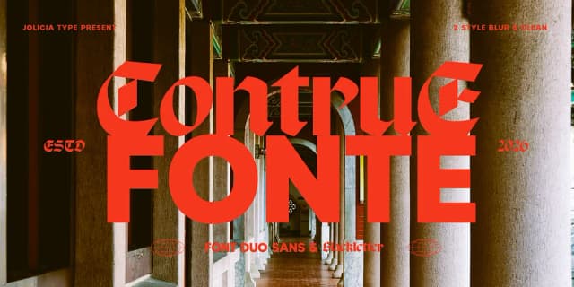
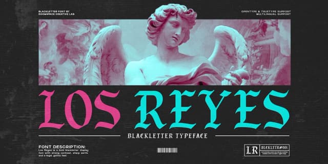
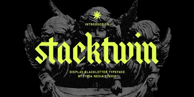
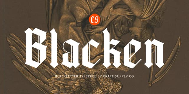
More Blackletter Fonts
Browse all →
What pairs well with CS Falcone Font?
CS Falcone Font is a blackletter font that shines as a display or heading face. Pair it with a clean serif or sans-serif font for body text — the contrast creates a clear hierarchy while the two styles stay balanced and easy to read.



CS Falcone Font
Reviewed by the FontBoxDL team · Updated June 2026