 Firefox
About Chirota Font
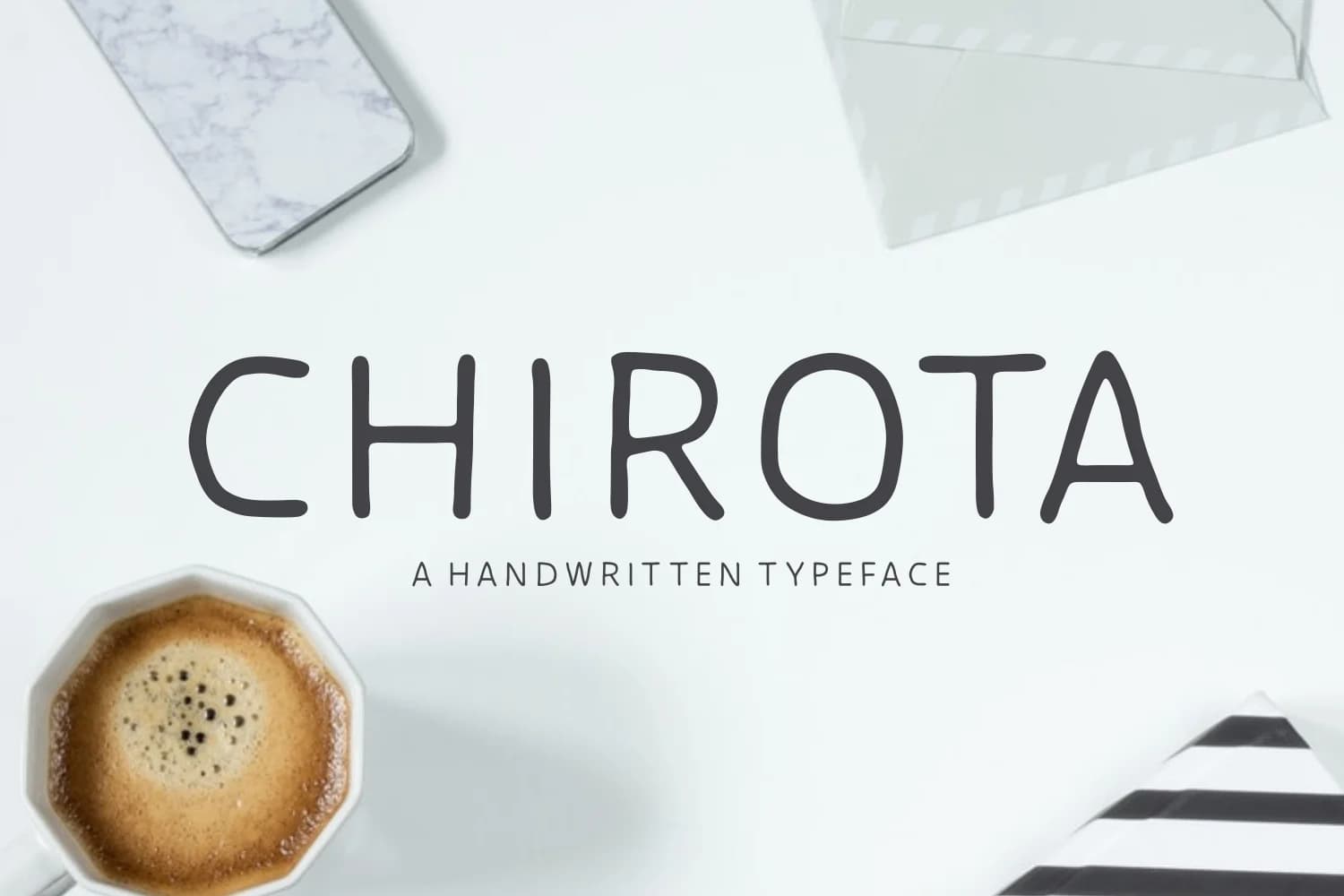
Chirota by Situjuh is a handwritten script featuring gently imperfect lines that create a warm, approachable character perfectly suited for contemporary design projects. The controlled wobble in the letterforms gives the typeface a genuine, hand-drawn quality that feels authentic and personal while maintaining excellent readability throughout every application and size range.
This font excels across multiple project types, from wedding invitation suites where its organic charm conveys intimacy and emotional resonance between sender and recipient, to greeting card and gift tag designs that benefit from its friendly, conversational personality. It works beautifully for nursery wall art decals that parents prefer over generic alternatives, and for cosmetic or artisanal product branding where the handmade aesthetic builds consumer trust and perceived value. The carefully balanced stroke weight ensures legibility remains strong even at smaller sizes, making the font versatile enough for both prominent headlines and supportive body text applications.
Whether you're creating personalized stationery for a small business, developing craft project graphics for a creative community, or designing label artwork for handmade product packaging, Chirota delivers authentic character without compromising readability. The typeface respects your audience by being both beautiful and functional. Discover Chirota on Creative Fabrica to add genuine handwritten charm to your next design project.
Style & Use Cases
- Overall Style
- Elegant, Flowing, Chirota
- Use Case
- Invitations, Branding
- Ideal For
- wedding stationery, greeting cards, and signatures
- Pairs With
- a simple uppercase sans
How to Install Chirota Font Font
Step-by-step instructions for every platform
- 1Download the Chirota Font font file (.ttf or .otf).
- 2Locate the downloaded file in your Downloads folder.
- 3Right-click the font file.
- 4Select "Install" to install for the current user, or "Install for all users" to make it available system-wide.
- 5Chirota Font is now available in Word, Photoshop, Illustrator, and all other apps.

Browse fonts by theme
Curated collections →Saw a font in a picture? Identify any font from an image with our free Font Finder.
More Script Handwritten Fonts
Browse all →







What pairs well with Chirota Font?
Chirota Font is a script font that shines as a display or heading face. Pair it with a clean sans-serif or serif font for body text — the contrast creates a clear hierarchy while the two styles stay balanced and easy to read.



Chirota Font
by Situjuh
Reviewed by the FontBoxDL team · Updated May 2026