
 1 / 10
About Bright Horse Font
Bright Horse is a blackletter typeface that merges medieval character forms with modern boldness, creating letterforms that feel both historically rooted and visually striking. Designed by Alit Design, it strips away ornamental excess while maintaining the dramatic weight and texture of traditional blackletter forms. The result reads immediately, not as pure historic revival, but as blackletter built for contemporary projects that demand real presence.
The font ships with 837 glyphs including a comprehensive set of stylistic alternates and uppercase ligatures, plus multilingual support and a collection of celestial and mystical symbols. You'll find it excels for vintage band logos, witchy cosmetics and skincare packaging, tattoo flash sheets, and book covers or editorial spreads where historical references add authority but period-piece aesthetics would feel dated. The alternates give you real flexibility to shift between more elaborate decorated forms and cleaner letterforms within the same project, so you can adjust visual weight and complexity to match whatever tone your work actually needs.
This typeface suits designers working on cultural and artistic projects where credibility flows from tradition and impact comes from contemporary craft. Get Bright Horse on Creative Fabrica.
Style & Use Cases
- Overall Style
- Ornate, Gothic
- Use Case
- Logos, Certificates
- Ideal For
- medieval themes, band merch, and tattoo lettering
- Pairs With
- a clean sans-serif for body text
How to Install Bright Horse Font
Step-by-step instructions for every platform
- 1Download the Bright Horse font file (.ttf or .otf).
- 2Locate the downloaded file in your Downloads folder.
- 3Right-click the font file.
- 4Select "Install" to install for the current user, or "Install for all users" to make it available system-wide.
- 5Bright Horse is now available in Word, Photoshop, Illustrator, and all other apps.
More by Alit Design
View all →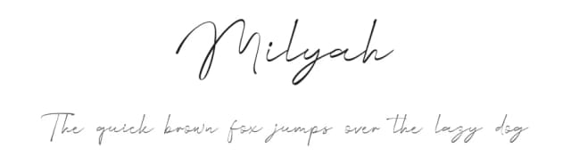
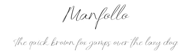
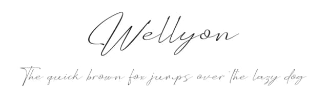
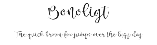
Browse fonts by theme
Curated collections →Saw a font in a picture? Identify any font from an image with our free Font Finder.
More Blackletter Fonts
Browse all →
What pairs well with Bright Horse Font?
Bright Horse Font is a blackletter font that shines as a display or heading face. Pair it with a clean serif or sans-serif font for body text — the contrast creates a clear hierarchy while the two styles stay balanced and easy to read.



Bright Horse Font
by Alit Design
Reviewed by the FontBoxDL team · Updated June 2026