 Firefox
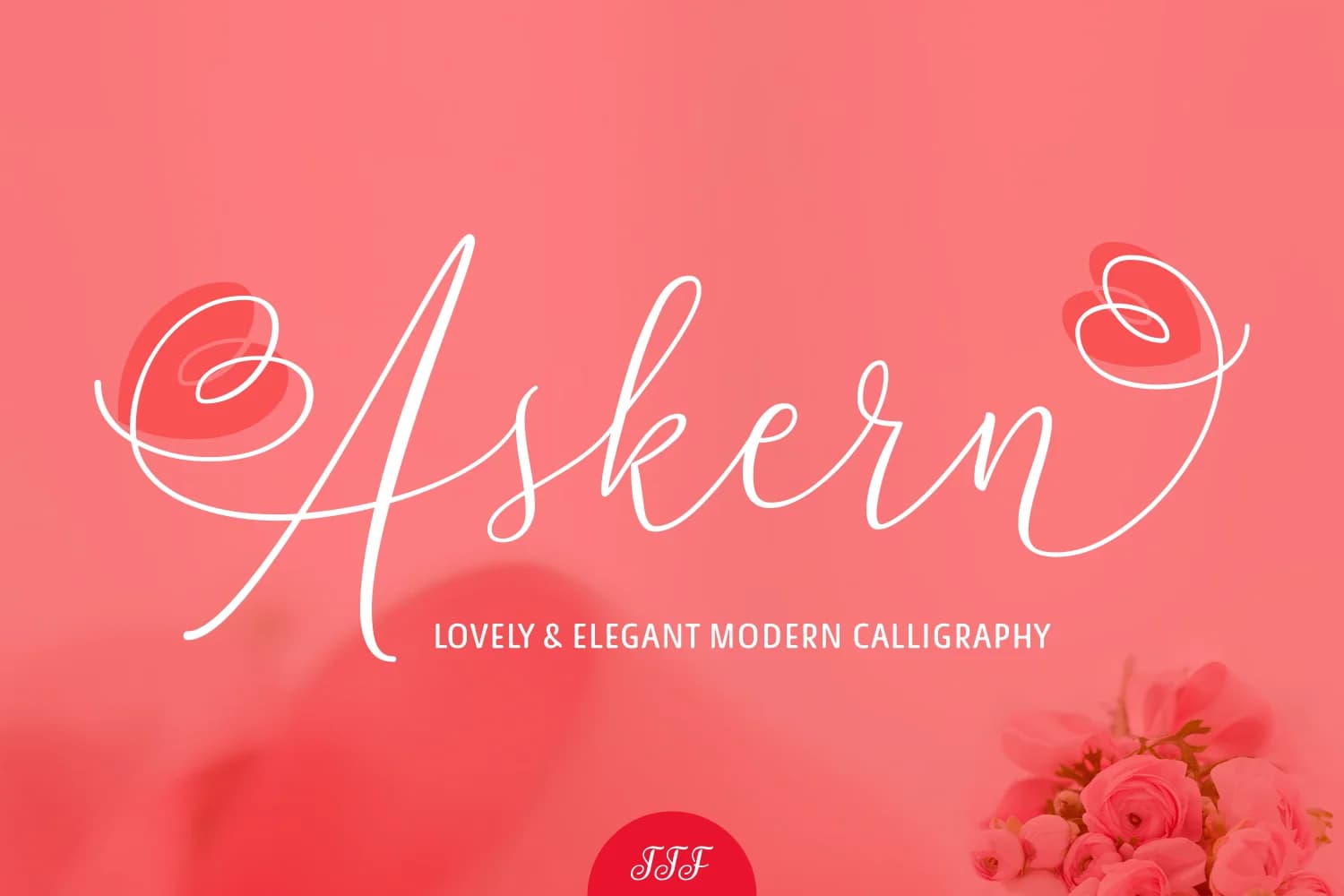 1 / 6
1 / 6About Askern Font
Askern by The Traveling Fox is a flowing handwritten script that brings refined character and dynamic personality to typography-driven projects. With its consistent letterforms and smooth connections, this font skillfully balances sophistication with natural movement, making it an ideal choice for designers who want expressive, handwritten typography without sacrificing clarity. The script's fluid strokes work beautifully across wedding invitation suites and formal event materials, where guests expect both visual clarity and understated elegance, while personalized monogram designs benefit significantly from Askern's refined yet expressive character. Custom greeting card layouts gain immediate visual interest and dimension when set in this flowing script, and the font also lends an authentic, artisanal quality to small-batch product packaging for boutique home goods and specialty jewelry brands. Beyond formal applications, Askern performs equally well in digital environments, lifestyle social media graphics and website headers benefit from its refined handwritten aesthetic. The consistent letterforms ensure readability whether your project lands on premium cardstock, screen displays, or varied print formats, making it a highly versatile tool for designers seeking both personality and professional polish in equal measure. Grab Askern on Creative Fabrica and add this handwritten elegance to your next design.
Style & Use Cases
- Overall Style
- Elegant, Flowing, Askern
- Use Case
- Invitations, Branding
- Ideal For
- wedding stationery, greeting cards, and signatures
- Pairs With
- a simple uppercase sans
How to Install Askern Font Font
Step-by-step instructions for every platform
- 1Download the Askern Font font file (.ttf or .otf).
- 2Locate the downloaded file in your Downloads folder.
- 3Right-click the font file.
- 4Select "Install" to install for the current user, or "Install for all users" to make it available system-wide.
- 5Askern Font is now available in Word, Photoshop, Illustrator, and all other apps.
More by The Traveling Fox
View all →
Browse fonts by theme
Curated collections →Saw a font in a picture? Identify any font from an image with our free Font Finder.
More Script Handwritten Fonts
Browse all →







What pairs well with Askern Font?
Askern Font is a script font that shines as a display or heading face. Pair it with a clean sans-serif or serif font for body text — the contrast creates a clear hierarchy while the two styles stay balanced and easy to read.



Askern Font
Reviewed by the FontBoxDL team · Updated May 2026