Firefox
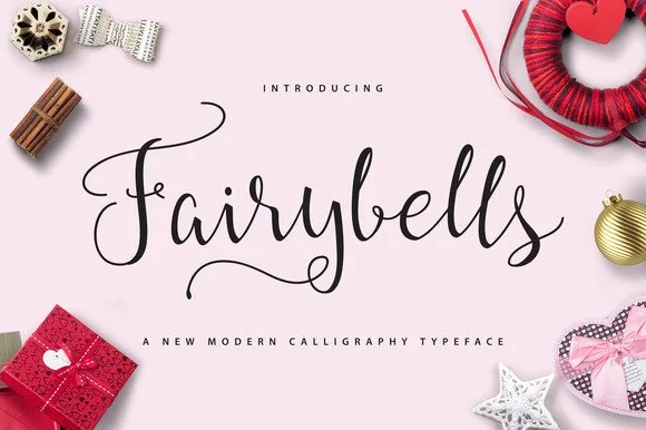
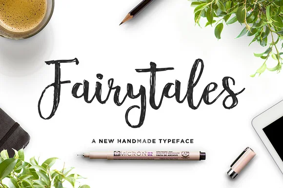
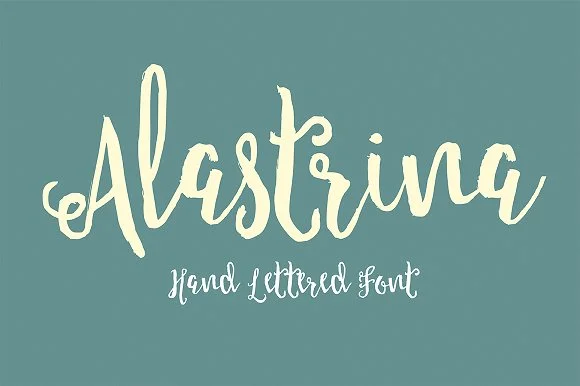

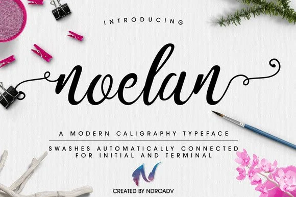
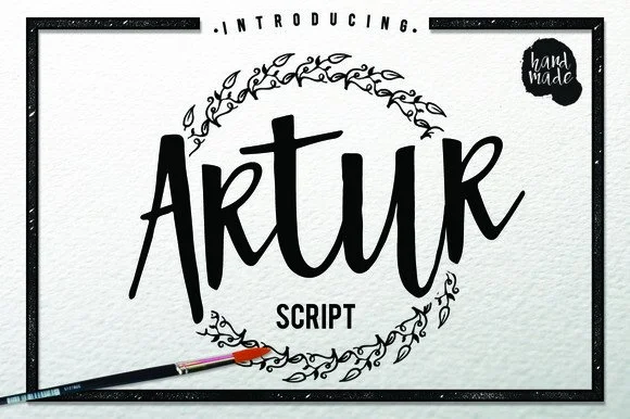
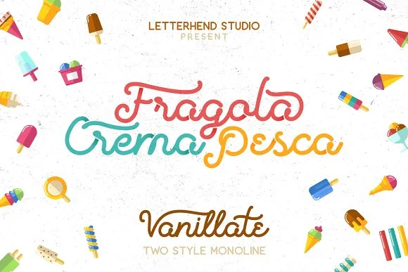
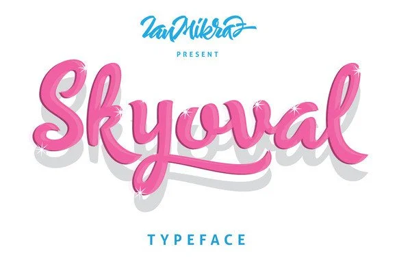
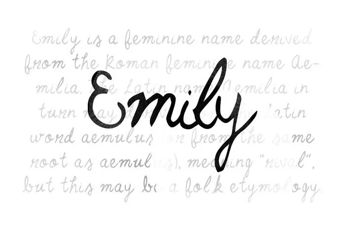
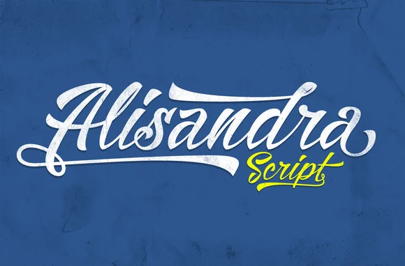
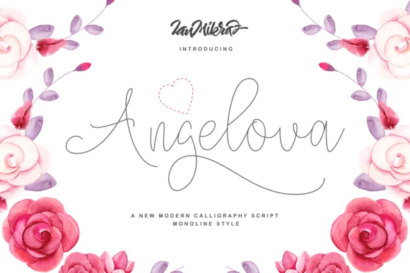
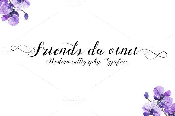
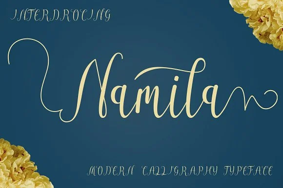
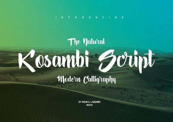
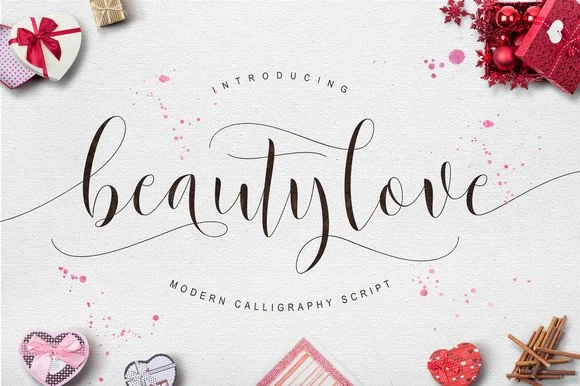

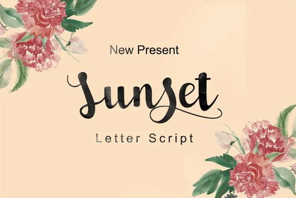
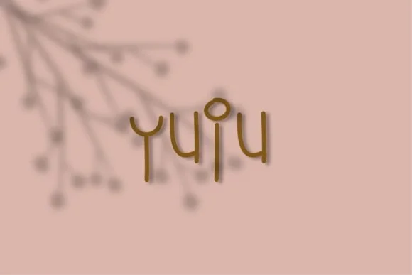
When to use a whimsy font
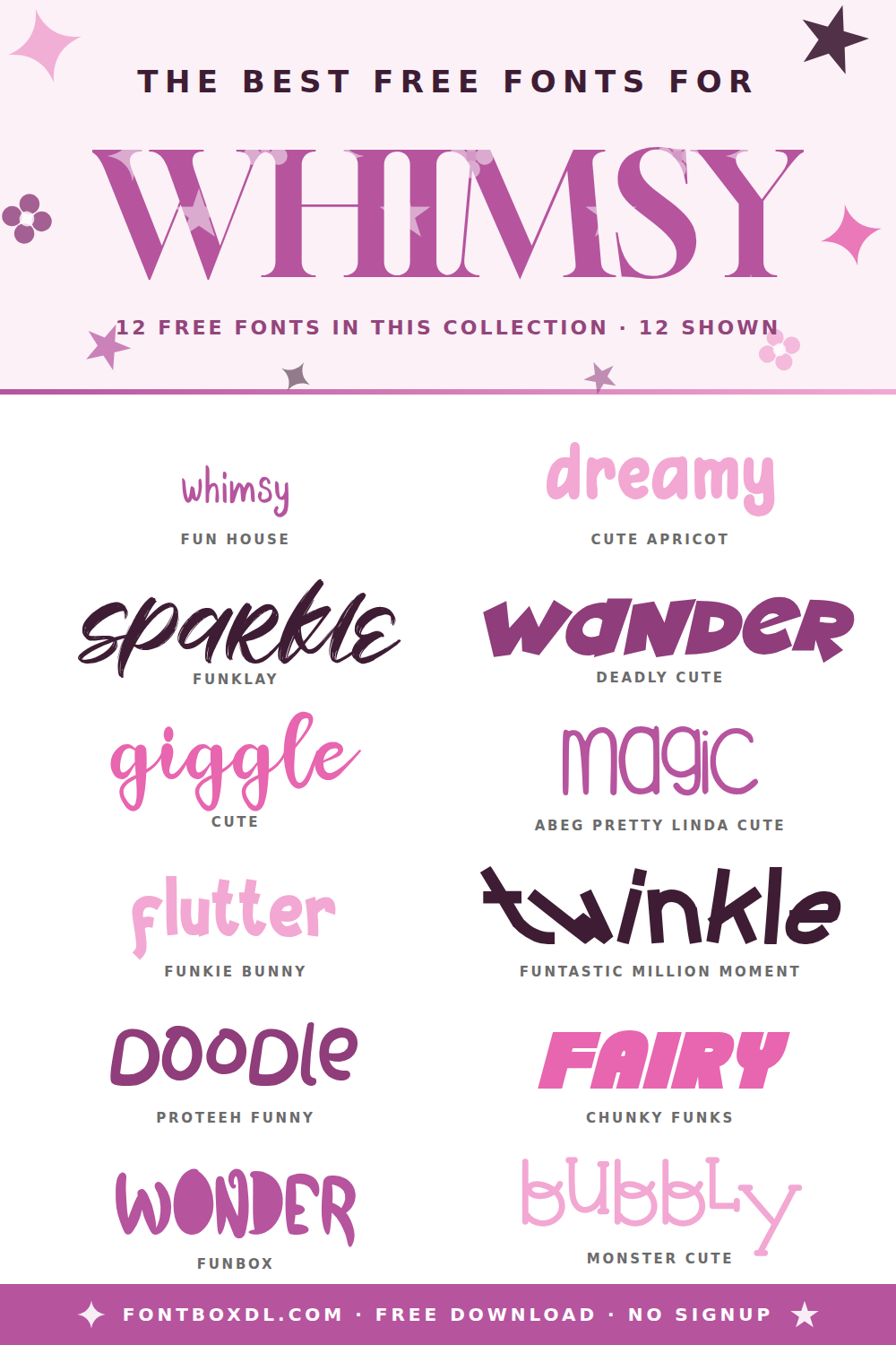
Whimsy typography works best when the rest of your design is calm — generous white space, a soft pastel or muted earth-tone palette, and simple iconography let the letterforms do the talking. Common project fits:
- Children's book covers, nursery prints, and birth announcements
- Cute brand identities for small bakeries, florists, gift shops, and stationery makers
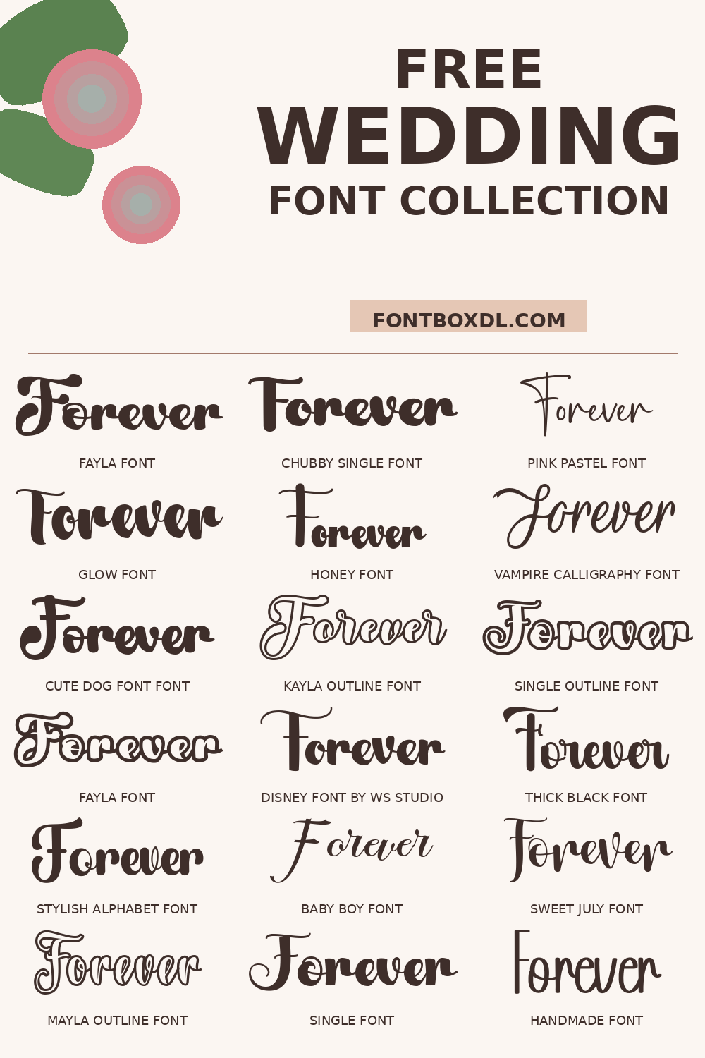
- Wedding signage that leans playful rather than formal
- Party printables, sticker sheets, and Cricut/Silhouette vinyl projects
- Mood boards and Canva templates for "soft girl" or cottage-core aesthetics
Pairing tips
A whimsy display font almost always needs a quieter partner. Try a clean humanist sans-serif (think Nunito or Inter) for body copy, or a soft slab serif if you want a touch more warmth without competing curves. Reserve the whimsy face for the headline, one or two product names, or a hand-signed signature line — using it everywhere quickly turns charming into chaotic.
Print and craft considerations
Many whimsical scripts include long swashes and tall ascenders. Before exporting for vinyl cutting or embroidery, preview your full text at the final size; thin connecting strokes can vanish at 1 inch or smaller. For Cricut and Silhouette users, look for fonts in this collection tagged as single-line or monoline — they cut cleanly without breaking on tight curves.
License and downloading
All fonts on FontBoxDL include the original creator's license. Most files here are free for personal use, with commercial licenses available directly from the designer. Each font's detail page links to the original source so you can confirm rights before using the typeface on a paid client project or a product you intend to sell.