Firefox

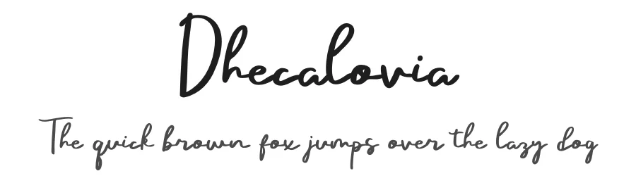

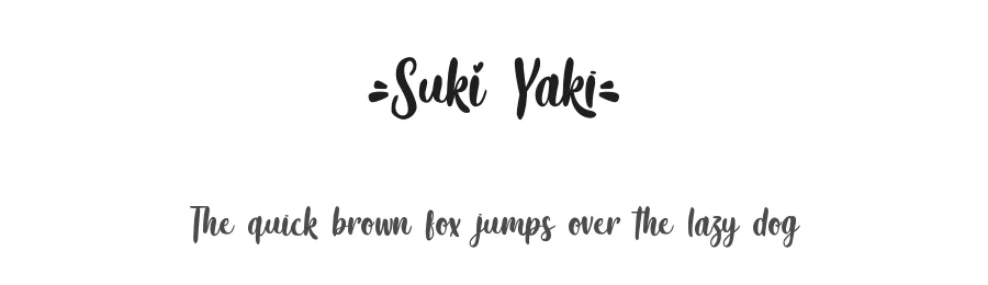
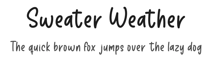
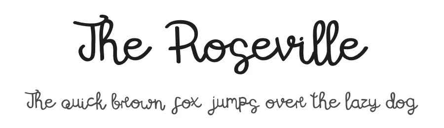
Best Use Cases for Stylish Fonts
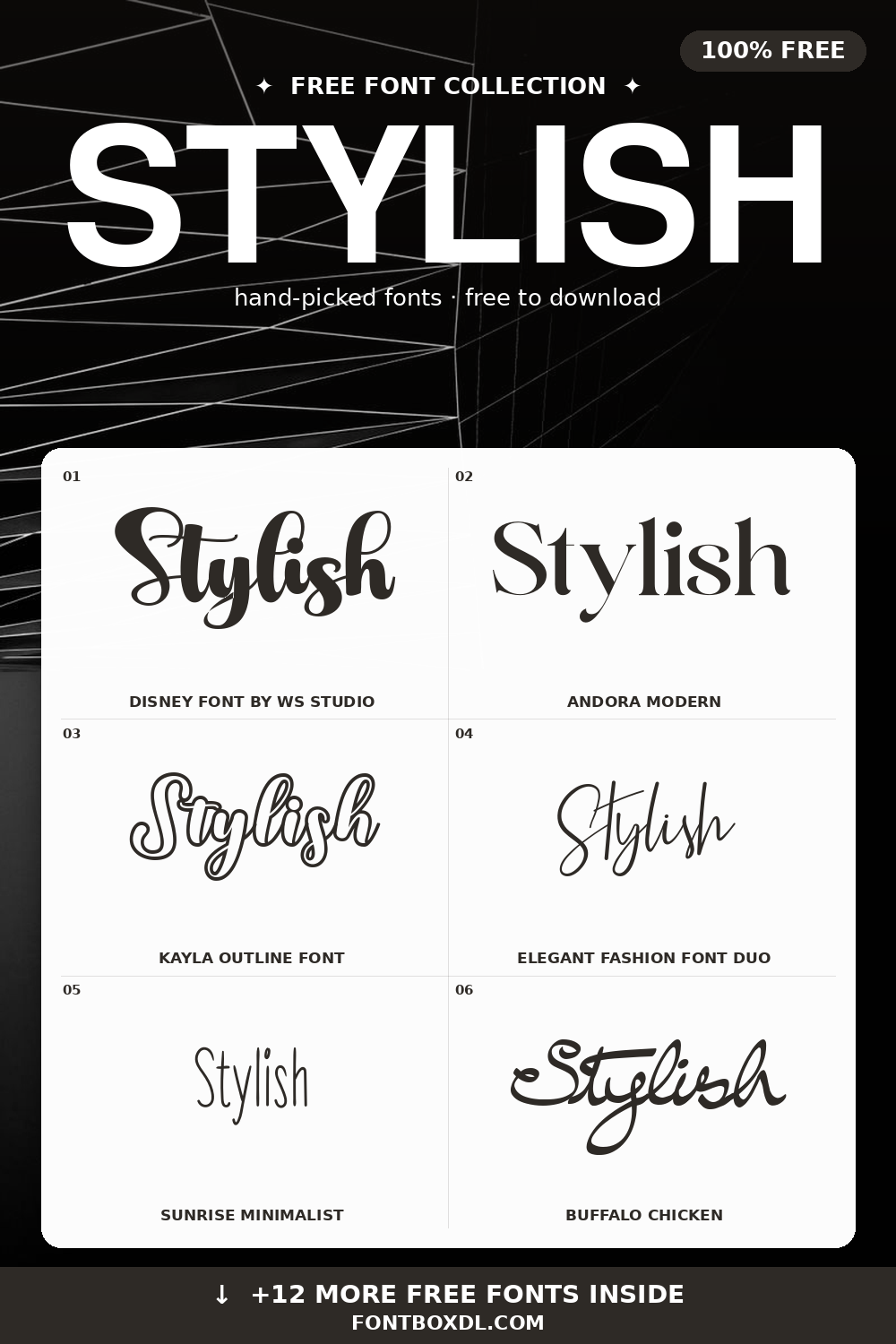
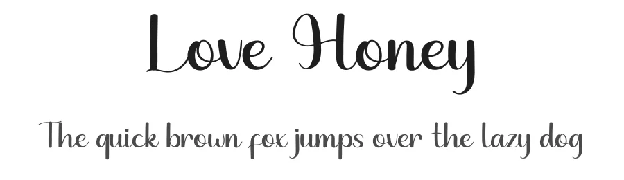
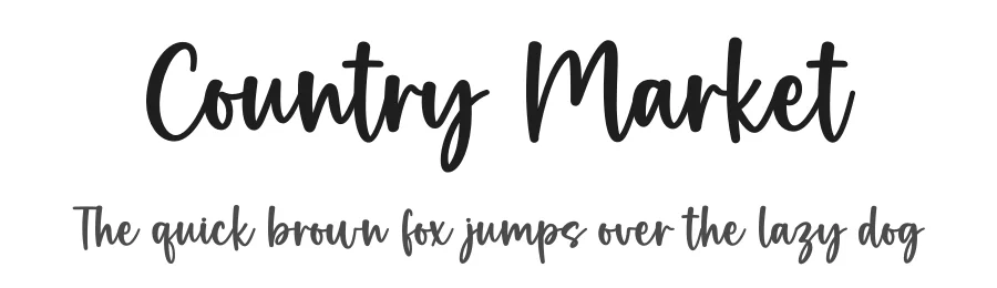
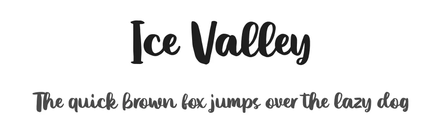
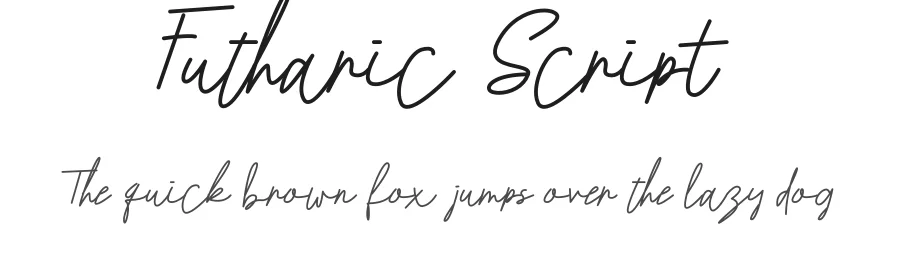
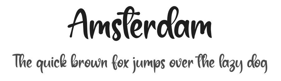
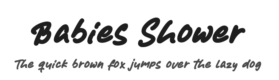
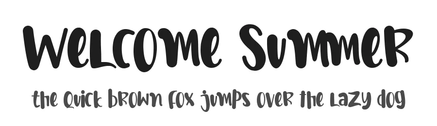
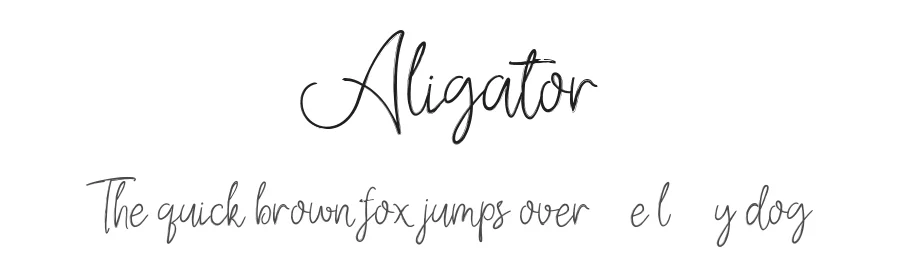
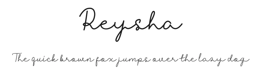
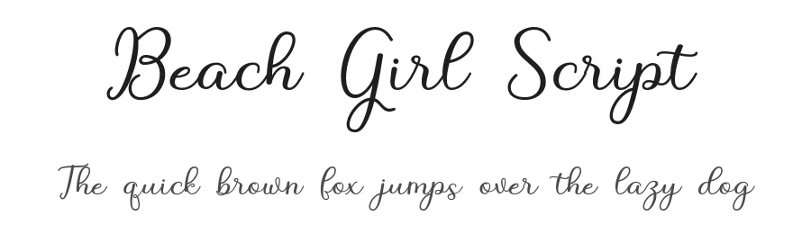
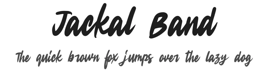
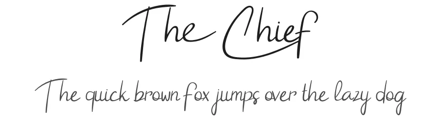
Stylish typefaces are the workhorses of modern branding: logos, Instagram quote posts, podcast covers, wedding stationery, lookbooks, online stores, and personal portfolios. They walk the line between fashion-forward and timeless, so designs do not age out in six months. Use them when the audience is design-savvy and the message needs to feel intentional.
Design Tips: Elegance Through Restraint
The trick with stylish fonts is restraint. Use one stylish display piece per layout, supported by a quiet body font and generous white space. Slightly increase letter-spacing on uppercase headings for that editorial, magazine-cover feel. Avoid heavy drop shadows or chunky outlines — let the letterforms themselves carry the style.
Pairing and Color
Pair an elegant script with a structured sans (Montserrat, Poppins, or Inter). For palette, neutrals plus one accent (soft sage, dusty rose, deep navy, or warm terracotta) feel current without being trendy. Cream backgrounds with charcoal text reads more upscale than pure white + black on most devices.
Print and Social Media
Stylish fonts tend to have thin strokes and ornamental details — beautiful in print at 12 pt and up, but they can disappear at small sizes on mobile. Always test on a phone screen. For Instagram carousel posts and Pinterest pins, prefer designs with medium weight and clear counters; reserve ultra-thin scripts for hero headlines only.
License
Each font's license is on its detail page. Many are free for personal use; commercial use (client work, paid social, merchandise) may require a license upgrade. Wedding stationery, small-batch products, and personal branding usually fall under personal use, but verify before publishing.