Firefox

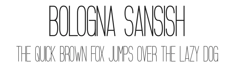
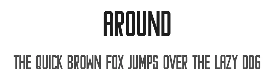
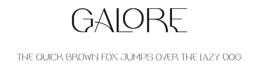
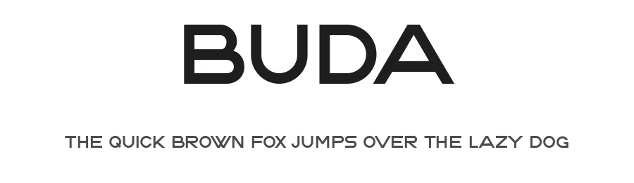
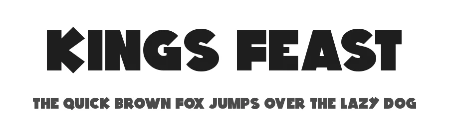
Best Use Cases for Banner Fonts
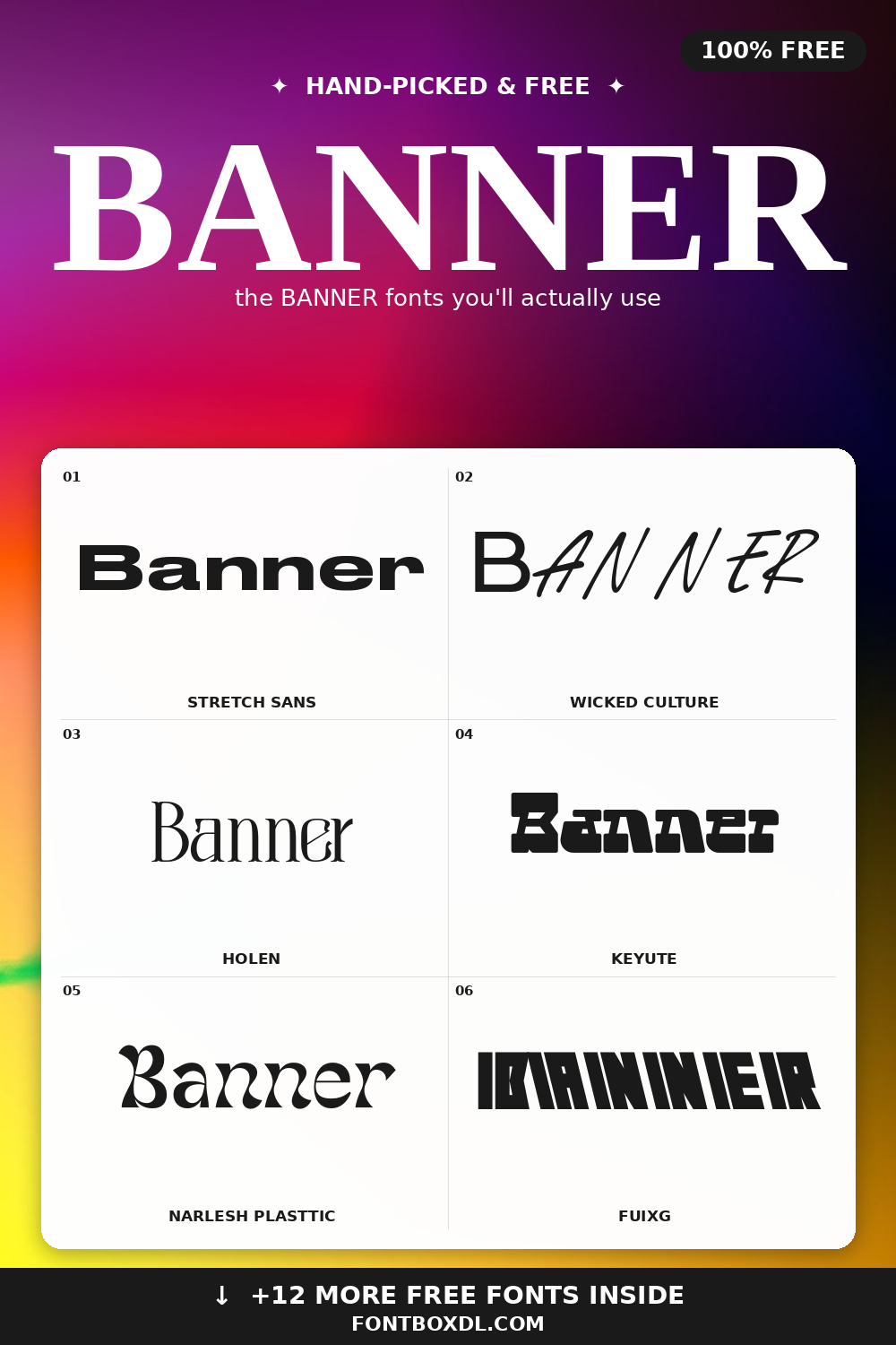
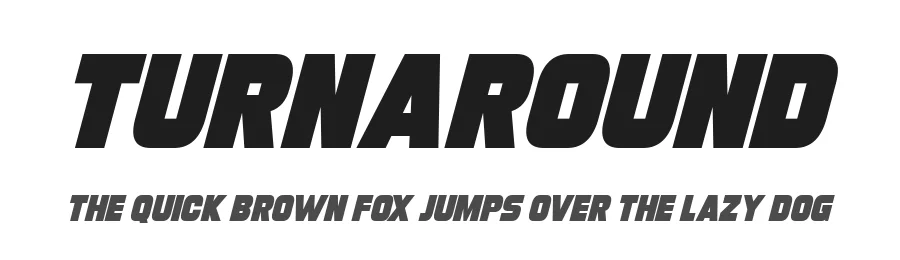
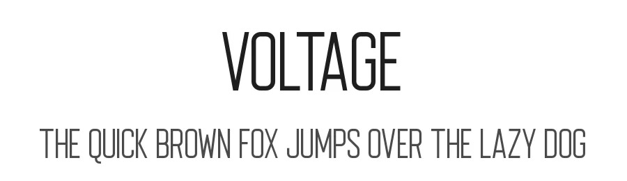
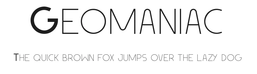
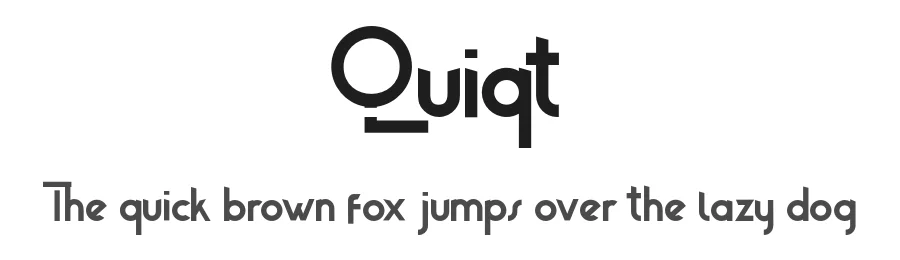
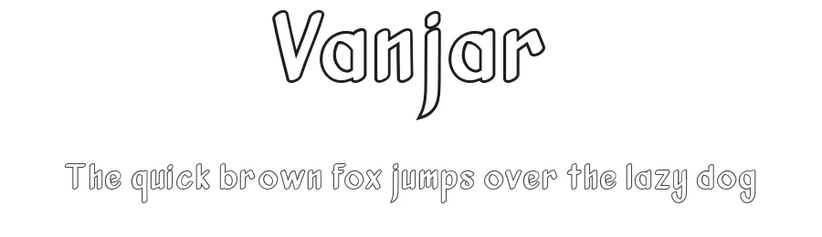
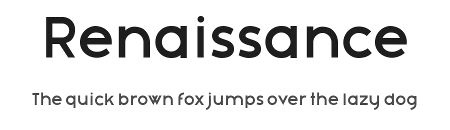
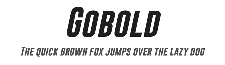
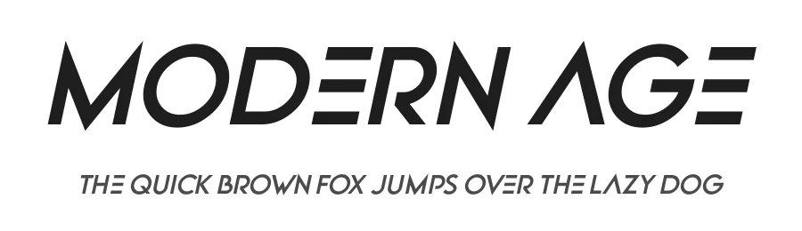
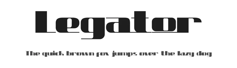
Banner fonts shine on posters, event flyers, YouTube thumbnails, sale signs, and storefront banners. Use them for short, punchy text — three to seven words usually works best. Pair a heavy banner font with plenty of negative space so the headline does the heavy lifting. For longer body copy, switch to a clean sans or serif so the reader is not overwhelmed.
Design Tips: Hierarchy and Spacing
The strength of a banner font is its weight and presence. Lock in a clear hierarchy: one dominant headline, one supporting line, one tiny detail line (date, location, URL). Tighten letter-spacing on uppercase headlines for a more confident, modern look. Add a thick underline, a stroke outline, or a solid color block behind the text to anchor the composition.
Pairing and Color
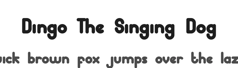
Pair heavy display banners with quiet partners: Inter, Lato, Source Sans, or Roboto for body text. High-contrast color combinations (warm + cool, or dark + cream) make banners pop on Instagram, Pinterest, and outdoor signage. Avoid pairing two display fonts in the same composition — let the banner font lead and keep the rest neutral.
Print and Web Considerations
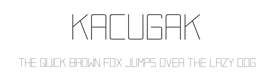
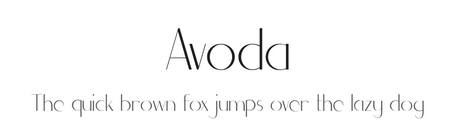
For print, choose fonts with closed apertures and uniform stroke weights — they reproduce reliably at any scale. For digital banners, test at small sizes too (mobile previews crop aggressively). When using these fonts in Cricut, Silhouette, or vinyl cutting projects, prefer designs without ultra-thin serifs that can break during weeding.
License
Each font's license is listed on its detail page. Most options are free for personal use; commercial use may require a license upgrade. Always check the linked terms before using a font in client work, merchandise, or paid campaigns.