 1 / 5
1 / 5About Worst Letters Font
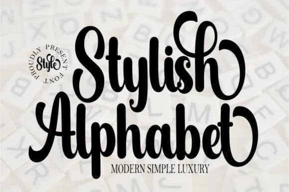
There's something refreshingly loose and playful about this script that doesn't come across as trying too hard. Worst Letters Font by Fallengraphic captures that hand-drawn confidence without the wobble or irregularity that can read as accidental. Built as a monoline script, every letterform carries the same stroke width, which makes it surprisingly flexible across different sizes and applications. This consistency in line weight is one of its biggest strengths when you're working on designs that need to hold up across multiple formats.
You'll find this script works beautifully for personalized gift tags on seasonal projects, custom quote designs for Cricut work, gnome-themed sublimation graphics, and summer craft labels for Etsy sellers. The casual letterforms feel equally at home in DIY wooden signage and hand-lettered gift wrapping. Because the lines stay consistent throughout, legibility holds up well whether you're printing it large on product packaging or using it smaller on gift tags and labels. There's a quality of approachability here that makes customers feel seen.
For any body text or secondary information you need alongside this script, pair it with a clean, modern sans-serif. The contrast between flowing letterforms and geometric lines creates natural visual hierarchy. Find Worst Letters Font on Creative Fabrica.
Style & Use Cases
- Overall Style
- Elegant, Flowing, Crafting
- Use Case
- Invitations, Branding
- Ideal For
- wedding stationery, greeting cards, and signatures
- Pairs With
- a simple uppercase sans
How to Install Worst Letters Font Font
Step-by-step instructions for every platform
- 1Download the Worst Letters Font font file (.ttf or .otf).
- 2Locate the downloaded file in your Downloads folder.
- 3Right-click the font file.
- 4Select "Install" to install for the current user, or "Install for all users" to make it available system-wide.
- 5Worst Letters Font is now available in Word, Photoshop, Illustrator, and all other apps.
More by Fallengraphic
View all →


More Script Handwritten Fonts
Browse all →
What pairs well with Worst Letters Font?
Worst Letters Font is a script font that shines as a display or heading face. Pair it with a clean sans-serif or serif font for body text — the contrast creates a clear hierarchy while the two styles stay balanced and easy to read.


Worst Letters Font
Reviewed by the FontBoxDL team · Updated June 2026