 Firefox
 1 / 2
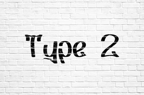
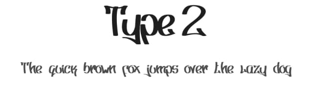
1 / 2About Type 2 Font
Type 2 by Nermin K is a bold graffiti script that brings sharp, contemporary street aesthetics to digital and print projects. With its hard edges and dynamic letterforms, this font excels at capturing authentic urban energy appealing to designers creating streetwear branding, music festival posters, skateboard graphic designs, hip-hop event flyers, and edgy apparel packaging. The font's structured approach to handwritten character forms makes it equally effective for striking social media headers or album artwork that demands immediate attention.
Beyond mainstream applications, Type 2 works beautifully for independent clothing labels and urban lifestyle brands wanting personality without sacrificing legibility. The bold strokes and confident styling translate well across scales, from large-format signage to smaller digital applications. Whether you're designing rebellious merchandise graphics, building a graffiti-inspired brand identity, crafting event promotions with attitude, or producing DIY street art prints, this font delivers the modern aesthetic your work demands. Its angular precision maintains readability even in complex compositions, making it suitable for both headline applications and standalone design statements. The structured letterforms ensure your message comes through loud and clear, whether displayed on skateboards, apparel tags, or urban posters. Discover how Type 2 can transform your designs on Creative Fabrica.
Style & Use Cases
- Overall Style
- Elegant, Flowing, Type 2
- Use Case
- Invitations, Branding
- Ideal For
- wedding stationery, greeting cards, and signatures
- Pairs With
- a simple uppercase sans
How to Install Type 2 Font Font
Step-by-step instructions for every platform
- 1Download the Type 2 Font font file (.ttf or .otf).
- 2Locate the downloaded file in your Downloads folder.
- 3Right-click the font file.
- 4Select "Install" to install for the current user, or "Install for all users" to make it available system-wide.
- 5Type 2 Font is now available in Word, Photoshop, Illustrator, and all other apps.
More by Nermin K
View all →

Browse fonts by theme
Curated collections →Saw a font in a picture? Identify any font from an image with our free Font Finder.
More Script Handwritten Fonts
Browse all →







What pairs well with Type 2 Font?
Type 2 Font is a script font that shines as a display or heading face. Pair it with a clean sans-serif or serif font for body text — the contrast creates a clear hierarchy while the two styles stay balanced and easy to read.



Type 2 Font
by Nermin K
Reviewed by the FontBoxDL team · Updated May 2026