 Firefox
 1 / 4
1 / 4About Swindon Font
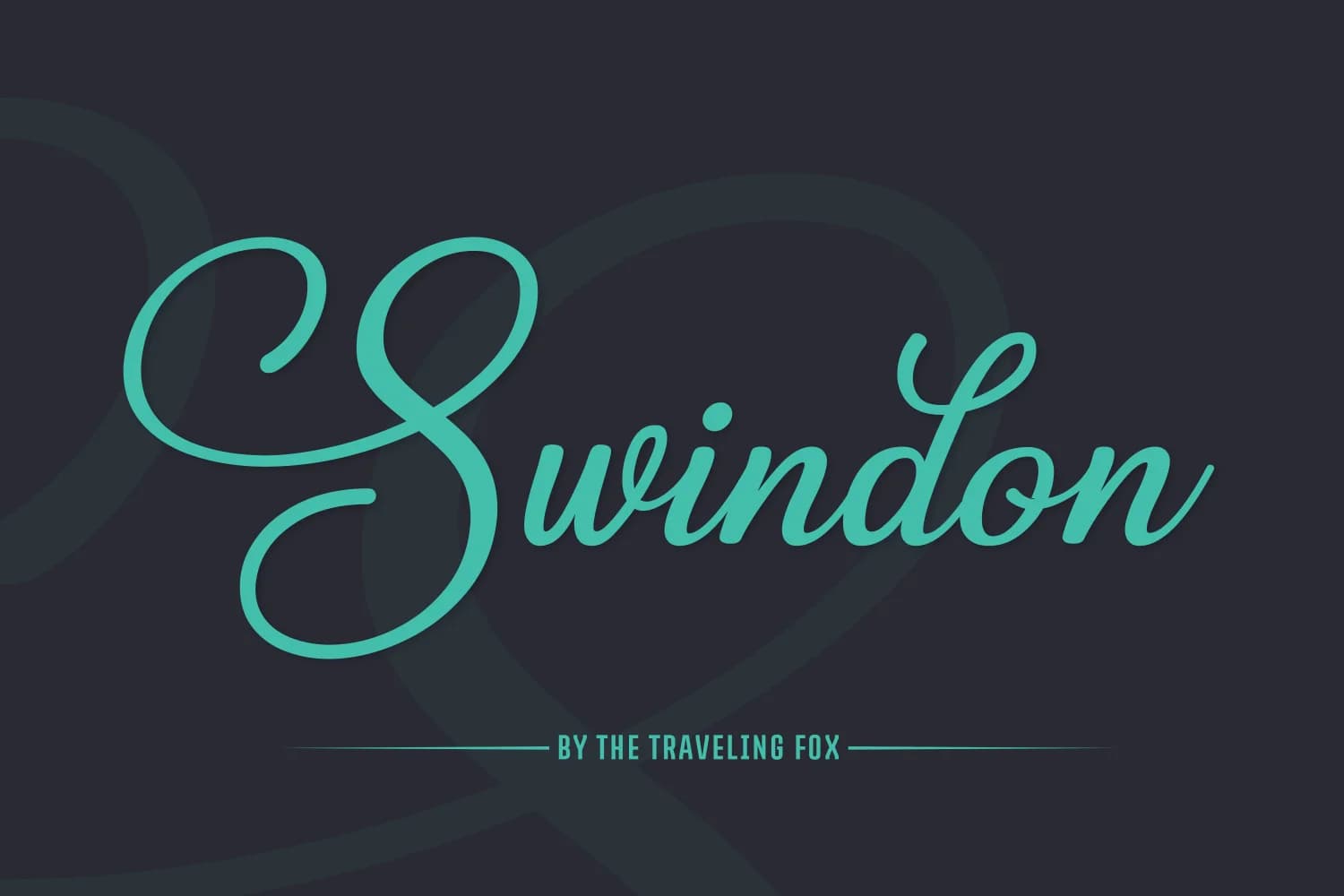
Swindon by The Traveling Fox is a bold, rounded handwritten script that brings warm approachability to contemporary design work. The substantial weight and soft curved letterforms create natural legibility across different point sizes, working seamlessly whether you're sizing up for prominent headlines or scaling down for detailed decorative elements. This balance between boldness and genuine friendliness makes it surprisingly versatile across diverse design applications and mediums, from print to digital. This playful yet polished typeface excels in greeting card suites, custom product labels, boutique packaging design, and personalized event signage. Wedding stationery projects, DIY craft labels, engaging social media graphics, and brand identity applications all benefit from its approachable character and professional presence. The rounded letterforms add distinctive personality while the solid weight commands visual attention without overwhelming layouts. The typeface maintains character and readability across print collateral, from invitations to postcards to posters, as well as digital graphics and web contexts. Its structured yet friendly construction makes it especially valuable for small business owners and independent designers seeking typefaces that balance playfulness with working credibility across varied applications. Discover Swindon on Creative Fabrica and add this characterful typeface to your creative toolkit.
Style & Use Cases
- Overall Style
- Elegant, Flowing, Swindon
- Use Case
- Invitations, Branding
- Ideal For
- wedding stationery, greeting cards, and signatures
- Pairs With
- a simple uppercase sans
How to Install Swindon Font Font
Step-by-step instructions for every platform
- 1Download the Swindon Font font file (.ttf or .otf).
- 2Locate the downloaded file in your Downloads folder.
- 3Right-click the font file.
- 4Select "Install" to install for the current user, or "Install for all users" to make it available system-wide.
- 5Swindon Font is now available in Word, Photoshop, Illustrator, and all other apps.
More by The Traveling Fox
View all →
Browse fonts by theme
Curated collections →Saw a font in a picture? Identify any font from an image with our free Font Finder.
More Script Handwritten Fonts
Browse all →







What pairs well with Swindon Font?
Swindon Font is a script font that shines as a display or heading face. Pair it with a clean sans-serif or serif font for body text — the contrast creates a clear hierarchy while the two styles stay balanced and easy to read.



Swindon Font
Reviewed by the FontBoxDL team · Updated May 2026