 Firefox
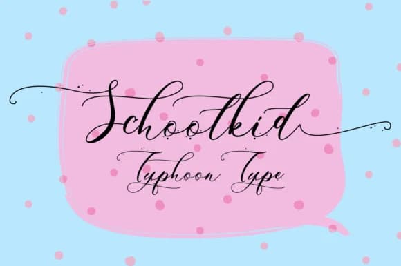
About Schoolkid Font
Schoolkid by Typhoon Type™ is a textured handwritten script with organic character and accessible personality. The font features a hand-drawn quality that brings warmth and visual interest to compositions, making it particularly suited for designs where feminine sensibility and authenticity matter. Its textured surface creates dimensional depth that draws the eye without overwhelming the overall layout. This distinctive script performs exceptionally well across specialized applications. Deploy Schoolkid for wedding invitation suites where couples want to convey intimate, personal touches rather than formal elegance. Apply it to personalized greeting card designs that genuinely feel handcrafted, or use it for boutique product packaging where artisanal appeal is central to brand identity. The font's textured details add visual depth throughout, commanding attention on both digital screens and printed materials, equally effective for custom stationery, hand-lettered signage, and branded social media graphics with personality. Whether you're creating packaging for small-batch goods, developing DIY craft labels, or designing personalized invitations, Schoolkid delivers consistent character that resonates with audiences seeking authenticity. The font's handwritten nature brings individuality to each application. Discover this textured script on Creative Fabrica and bring genuine personality to your next design project.
Style & Use Cases
- Overall Style
- Elegant, Flowing, Schoolkid
- Use Case
- Invitations, Branding
- Ideal For
- wedding stationery, greeting cards, and signatures
- Pairs With
- a simple uppercase sans
How to Install Schoolkid Font Font
Step-by-step instructions for every platform
- 1Download the Schoolkid Font font file (.ttf or .otf).
- 2Locate the downloaded file in your Downloads folder.
- 3Right-click the font file.
- 4Select "Install" to install for the current user, or "Install for all users" to make it available system-wide.
- 5Schoolkid Font is now available in Word, Photoshop, Illustrator, and all other apps.
More by Typhoon Type™
View all →



Browse fonts by theme
Curated collections →Saw a font in a picture? Identify any font from an image with our free Font Finder.
More Script Handwritten Fonts
Browse all →







What pairs well with Schoolkid Font?
Schoolkid Font is a script font that shines as a display or heading face. Pair it with a clean sans-serif or serif font for body text — the contrast creates a clear hierarchy while the two styles stay balanced and easy to read.



Schoolkid Font
Reviewed by the FontBoxDL team · Updated May 2026