 1 / 7
1 / 7About Richard Keild Font
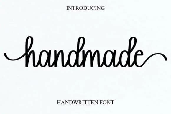
This typeface channels understated romance and genuine warmth. Richard Keild, designed by Blankids Studio, is a handwritten script that balances lightness with real personality while maintaining readability across different sizes and contexts.
The flowing letterforms feel polished without sacrificing the humanity that makes handwritten scripts so compelling in the first place. You'll see Richard Keild shine across wedding invitation suites where formality meets intimacy, luxury brand identities that need personality and depth, hand-lettered thank you cards and custom stationery, boutique packaging for skincare or artisanal fragrance, and intimate event menus. What distinguishes it from heavier script fonts is the consistent stroke weight and the natural way each letter connects, making it equally effective at small sizes or as a bold headline. The design avoids the stiffness that can sometimes make formal scripts feel distant, instead delivering the kind of refined elegance that reads as personal rather than pretentious. Its moderate weight gives it real versatility without sacrificing the character that makes it interesting.
Pair Richard Keild with a contemporary sans-serif for body copy, and the pairing will feel both refined and accessible. You can find it on Creative Fabrica and put it to work.
How to Install Richard Keild Font Font
Step-by-step instructions for every platform
- 1Download the Richard Keild Font font file (.ttf or .otf).
- 2Locate the downloaded file in your Downloads folder.
- 3Right-click the font file.
- 4Select "Install" to install for the current user, or "Install for all users" to make it available system-wide.
- 5Richard Keild Font is now available in Word, Photoshop, Illustrator, and all other apps.
More by Blankids Studio
View all →


More Script Handwritten Fonts
Browse all →

What pairs well with Richard Keild Font?
Richard Keild Font is a script font that shines as a display or heading face. Pair it with a clean sans-serif or serif font for body text — the contrast creates a clear hierarchy while the two styles stay balanced and easy to read.


Richard Keild Font
Reviewed by the FontBoxDL team · Updated June 2026