
 1 / 8
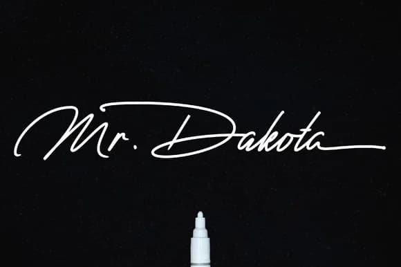
1 / 8About Mr. Dakota Font
Mr. Dakota by Fauzi is a hand-lettered script font that brings genuine handwritten character to your designs while remaining fully legible at any size. The flowing, organic letterforms capture that personal touch of authentic penmanship, with strokes that feel natural and unforced rather than mechanical. Unlike overly rigid or overtly decorative scripts, this typeface balances the warmth of handwriting with the polish and clarity that professional design work demands.
This versatile script excels across specific applications: wedding invitation suites where every detail communicates elegance and intimacy, boutique skincare packaging that needs a premium artisanal feel, DIY craft signs that appeal to home décor enthusiasts, and handmade product labels for Etsy sellers building their brand identity. The font's natural rhythm also shines in stationery branding projects, personalized greeting card designs, and decorative text overlays where personality enhances rather than overwhelms your overall message.
Whether you're creating upscale invitations, designing premium packaging for a small-batch beauty brand, building social graphics with character and warmth, or crafting personalized gift tags for handmade goods, Mr. Dakota adapts seamlessly to each context. Bring authentic script elegance to your next project with Mr. Dakota, available now on Creative Fabrica.
Style & Use Cases
- Overall Style
- Elegant, Flowing, Mr Dakota
- Use Case
- Invitations, Branding
- Ideal For
- wedding stationery, greeting cards, and signatures
- Pairs With
- a simple uppercase sans
How to Install Mr. Dakota Font Font
Step-by-step instructions for every platform
- 1Download the Mr. Dakota Font font file (.ttf or .otf).
- 2Locate the downloaded file in your Downloads folder.
- 3Right-click the font file.
- 4Select "Install" to install for the current user, or "Install for all users" to make it available system-wide.
- 5Mr. Dakota Font is now available in Word, Photoshop, Illustrator, and all other apps.

More Script Handwritten Fonts
Browse all →







What pairs well with Mr. Dakota Font?
Mr. Dakota Font is a script font that shines as a display or heading face. Pair it with a clean sans-serif or serif font for body text — the contrast creates a clear hierarchy while the two styles stay balanced and easy to read.



Mr. Dakota Font
by Fauzi
Reviewed by the FontBoxDL team · Updated May 2026