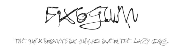
 1 / 3
1 / 3Preview Text
Loading font…
About Econo Sans Font
The most space-saving sans serif
Even the name of the font implies its function: French for the infinitive to save is économiser. Now if that doesnt sound good
This font saves more space
than any of its kind!
Slim proportions,
but not condensed
Characters which nearly touch
Sparse ascenders and descenders
Distinct forms
How close to each other can the characters of a font get? Theoretically, as close as you want. But obviously, the words should still be legible. And as any designer knows, body clearance of characters also depends on other parameters such as point size and line spacing.
In practice, there are always situations in which as much information as possible has to be positioned in as little space as possible.
The ingoFont ÉconoSans is made for exactly this purpose.
The shapes of the upper and lower case letters are completely matter-of-fact, the way a modern font has got to be. The letters c, e, and s are wide open to their neighbors. An especially distinguished trait of this font is the design of the triangular characters v, w, y, x, k, z and A, V, W, Y, Z, K, X, M, N. And the open form of B, R and P is also not typical in a sans serif.
The distance between letters is kept tight and often the characters nearly touch, but only nearly.
Results of a comparison*: With ÉconoSans you gain approximately 20% more text in a line than with Tahoma, and even still more than 10% compared to Helvetica Neue, not to mention the old normal Helvetica
* In order to truly compare, the fonts were measured up to the same visual size, i.e. ÉconoSans 12 pts, Avenir Next 12.5 pts, Bell Centennial 12.5 pts, Helvetica 11 pts, Tahoma 11 pts.
More...
In addition to the normal figures, ÉconoSans also includes tabular figures with unvarying width as well as ligatures (character connections). Among the ligatures, the double mm is especially unusual and is hardly familiar, but can contribute greatly to saving space without catching the readers eye.
Tabular figures and ligatures can be turned on and off by means of the corresponding Open Type functions of the user program.
The font downloadable here is a reduced version (without punctuation, ligatures, numbers etc.). A commercial version of this font (with all features) is available at
www.ingofonts.com
.
How to Install Econo Sans Font
Step-by-step instructions for every platform
- 1Download the Econo Sans font file (.ttf or .otf).
- 2Locate the downloaded file in your Downloads folder.
- 3Right-click the font file.
- 4Select "Install" to install for the current user, or "Install for all users" to make it available system-wide.
- 5Econo Sans is now available in Word, Photoshop, Illustrator, and all other apps.
More by ingoFonts
View all →


More Sans Serif Fonts
Browse all →


What pairs well with Econo Sans Font?
Econo Sans Font is a versatile sans-serif font that works for both headings and body text. Pair it with a contrasting serif or slab serif font to add visual interest and a clear distinction between titles and body copy.


Premium Sans Serif Fonts
★ PremiumWant something with more weights, glyphs, and commercial polish? These premium sans serif fonts are worth a look.


Econo Sans Font
by ingoFonts
Reviewed by the FontBoxDL team · Updated June 2026
License: Free for personal use
Econo Sans Specifications
| Font Family | EconoSans Red Light |
| Style | Regular |
| Full Name | EconoSansRed-45Light |
| Version | 3.009 |
| Weight | 300 (Light) |
| Glyph Count | 56 glyphs |
| PostScript Name | EconoSansRed-45Light |
| Designer | Ingo Zimmermann |
| Format | OTF (CFF) |
| File Size | 10.2 KB |
Languages Supported
Econo Sans supports 89 languages.