
 1 / 4
1 / 4About Drum Font
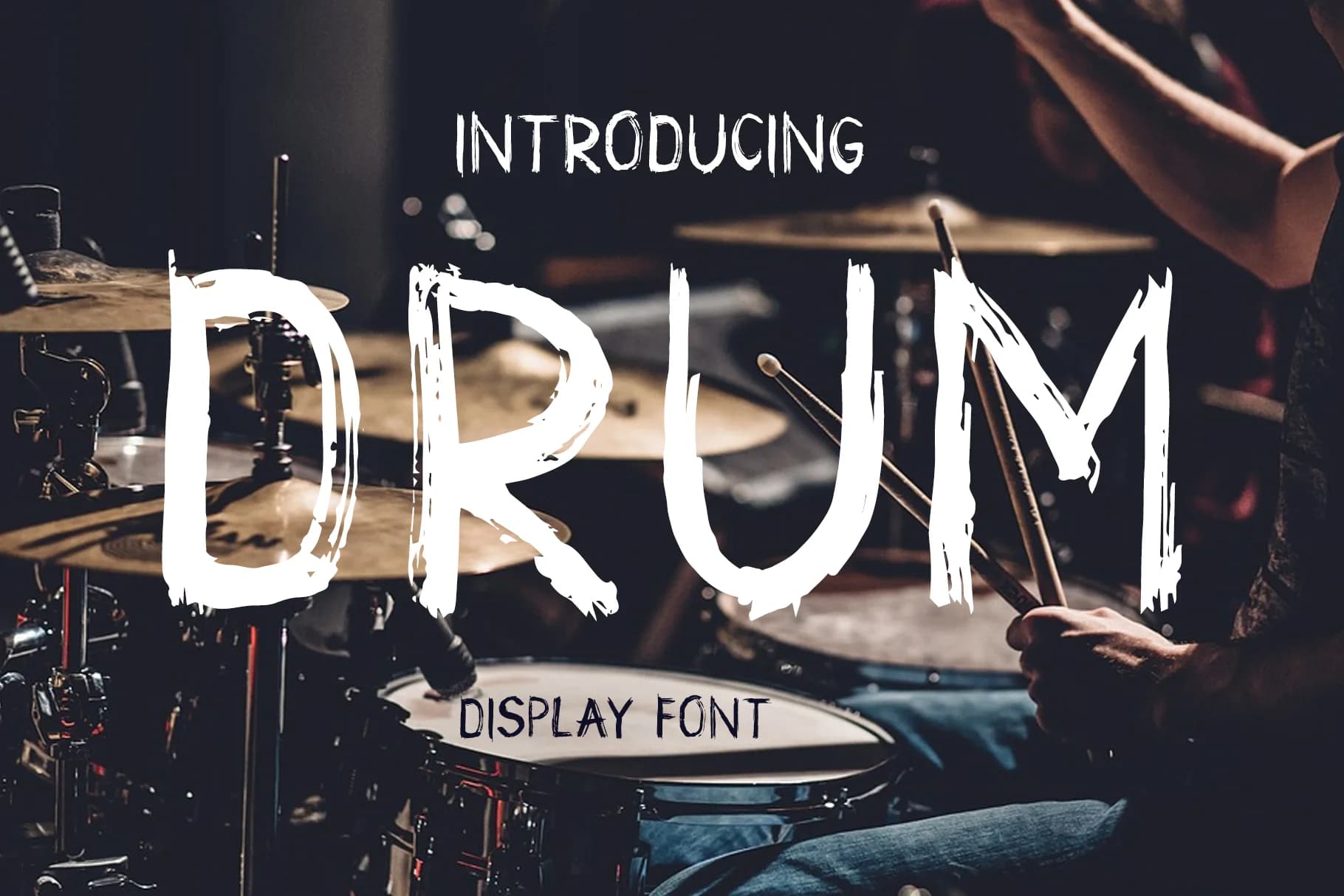
Drum by Peliken is a grunge-styled display font built entirely in capital letters, bringing a raw, distressed aesthetic to headlines and cover designs. The textured character set conveys attitude and edge while maintaining readability, making it ideal for creative projects demanding visual impact and unconventional personality.
This typeface thrives in contexts where authenticity and grit matter most. Skateboard graphics and streetwear apparel branding benefit from its intentionally worn appearance and street-level credibility. Band logos and concert poster designs gain instant alternative appeal, while podcast cover artwork and underground zine headers command attention at any scale. Tattoo artists and ink studios frequently reference Drum as inspiration for hand-lettered scripts. Beyond aesthetics, the all-caps limitation becomes a creative strength, unifying all text in a consistent, immediately recognizable visual language that strengthens brand recognition.
Drum's distressed texture maintains clarity from large-scale installations down to smaller digital applications, performing equally well on screens and in print. Whether you're developing a music promotion campaign, designing skateshop window signage, creating underground publication branding, or building a streetwear collection identity, this font delivers the raw, unpolished authenticity your brand needs. Grab Drum from Creative Fabrica to bring this grunge-styled aesthetic into your creative toolkit.
Style & Use Cases
- Overall Style
- Elegant, Flowing, Drum
- Use Case
- Invitations, Branding
- Ideal For
- wedding stationery, greeting cards, and signatures
- Pairs With
- a simple uppercase sans
How to Install Drum Font Font
Step-by-step instructions for every platform
- 1Download the Drum Font font file (.ttf or .otf).
- 2Locate the downloaded file in your Downloads folder.
- 3Right-click the font file.
- 4Select "Install" to install for the current user, or "Install for all users" to make it available system-wide.
- 5Drum Font is now available in Word, Photoshop, Illustrator, and all other apps.
More by Peliken
View all →
Browse fonts by theme
Curated collections →Saw a font in a picture? Identify any font from an image with our free Font Finder.
More Script Handwritten Fonts
Browse all →







What pairs well with Drum Font?
Drum Font is a script font that shines as a display or heading face. Pair it with a clean sans-serif or serif font for body text — the contrast creates a clear hierarchy while the two styles stay balanced and easy to read.



Drum Font
by Peliken
Reviewed by the FontBoxDL team · Updated May 2026