 Firefox
 1 / 2
1 / 2About Chicken Fried Steak Font
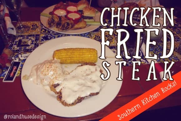
Chicken Fried Steak by Roland Hüse Design is a playful, hand-lettered font that channels comfort food aesthetics through its casual, sketchy character and informal letterforms. The design captures the relaxed charm of American casual dining culture, making it an ideal choice for projects that call for approachable typography with genuine personality and visual warmth.
This font excels in diner menu design, barbecue restaurant branding, food truck signage, and casual restaurant identity materials. Its expressive, hand-drawn style works particularly well for comfort food product packaging labels, vintage-inspired diner signage, and quick-service restaurant menus where authenticity and approachability matter most. Whether you're creating marketing materials for a retro-themed cafe or designing rustic food brand assets, Chicken Fried Steak brings authentic character and friendly energy to the table without feeling forced or unnecessarily ornate.
The font's cartoonish proportions and sketchy quality add visual texture and personality to casual dining and food service design projects. Its informal aesthetic shines in contexts where unpretentious, conversational communication resonates with your audience. Get Chicken Fried Steak from Creative Fabrica and add genuine character to your next comfort food brand or casual dining design.
Style & Use Cases
- Overall Style
- Elegant, Flowing, Chicken Fried Steak
- Use Case
- Invitations, Branding
- Ideal For
- wedding stationery, greeting cards, and signatures
- Pairs With
- a simple uppercase sans
How to Install Chicken Fried Steak Font Font
Step-by-step instructions for every platform
- 1Download the Chicken Fried Steak Font font file (.ttf or .otf).
- 2Locate the downloaded file in your Downloads folder.
- 3Right-click the font file.
- 4Select "Install" to install for the current user, or "Install for all users" to make it available system-wide.
- 5Chicken Fried Steak Font is now available in Word, Photoshop, Illustrator, and all other apps.
More by Roland Hüse Design
View all →


Browse fonts by theme
Curated collections →Saw a font in a picture? Identify any font from an image with our free Font Finder.
More Script Handwritten Fonts
Browse all →







What pairs well with Chicken Fried Steak Font?
Chicken Fried Steak Font is a script font that shines as a display or heading face. Pair it with a clean sans-serif or serif font for body text — the contrast creates a clear hierarchy while the two styles stay balanced and easy to read.



Chicken Fried Steak Font
Reviewed by the FontBoxDL team · Updated May 2026